
This is going to sound crazy.
Maybe
even sacrilegious to some in the collecting world.
But
I’ve always considered brands like Fleer and Donruss to be also-rans. And that
doesn’t made sense. Fleer and Donruss showed up a year into my collecting life.
I was seven. Seven-year-olds don’t even also-rans. A lot of stuff is still new
to seven-year-olds. Hell, in 1981, I didn’t even know that Fleer and Donruss
weren’t making cards.
Yet
I can’t shake that feeling whenever I see Fleer or Donruss cards.
Also-rans.
Maybe I drank the
Kool-Aid and believed Topps when they said they were “The Real One.” Parents
are a big influence too. My old man wasn’t a card collector, and probably
thought the money he’d seen me and my brother waste on them as profligate or
less-than-smart. But my old man had opinions. And he liked to share them. If he
commented on our card-collecting habits at all, aside from the money we were
wasting on them, it was to let me and my brother know that Topps really was
“the real one.”
Because they were
the only cards around when he was a kid.
And everyone knows
that their generation is the best, right?
So, I always had
this sense of “other” with Fleer and Donruss. To be even more honest, the
“otherness” is more geared toward Donruss than Fleer. Fleer cards were actually
pretty present in my life during the 1980s. They were available from the
get-go. The first wax box I ever opened was 1982 Fleer. Revco drugs had them.
If I wanted Donruss I had to risk life and limb cross the intersection at
Beulah and Frankstown Road, to get to Statlander Pharmacy. And anyone reading
this from Penn Hills knows what I’m talking about. We all knew someone who was
in a car accident at that intersection.
I wasn’t risking
my life for Donruss.
But we’ll get to
Donruss next week.
Last week when I
ranked Topps I ranked them best to worst. With words, and how one uses words,
being of the utmost importance these days, I fear I misspoke. You see, I’m just
a jerk who collects baseball cards. I’m no expert. I couldn’t honestly tell you
what the best to worst baseball card of a brand in a decade is. In essence, I
used the wrong words. What I should’ve said is that I’m ranking Topps, Fleer
and Donruss cards of the 80s by MY favorite design to least favorite design.
So that’s how
we’ll consider these ranking blog posts from this point on.
One collector’s
humble opinion.

I recently wrote a blog post about 1987 Fleer baseball cards, so excuse me if I get a bit redundant here. But, if 1987 Topps did not exist, 1987 Fleer would not only be my favorite Fleer design of the decade, but also my favorite baseball card design of any brand in the 1980s. I’m an absolute fan of everything Fleer was doing with this design, from the icy-blue borders that fade into white, to the icy-blue bar that resurfaces at the bottom of the card. 1987 IS my wheelhouse. I love the 3-D like design of the player image, the way a bit of the photo pops out onto the border. And I love the simplicity of where Fleer places its brand name in juxtaposition to the team logo.
1987
Fleer brings back so many memories. The turn-of-the-century Jim Leyland helmed
Pirates lead by Barry Bonds, Bobby Bonilla and Andy Van Slyke, vying for
respectability in the NL East. Summer evenings sitting on my bed, going through
these cards. 1987 Fleer reminds me of how further my reach was in collecting.
The ability to walk further out of my neighborhood to seek these out. Going to
card shows.
My
God, how they bring me right back to my youth.

1983 Fleer and the next design we’ll discuss could almost be interchangeable for me on this list, as I love them both. 1983 Fleer gets the edge for personal reasons. But the design itself is fantastic. I love that the border is gray. That it’s a wide gray that still allows for a good size player picture. And how about those pictures. Everything about 1983 reminds me of early baseball. Those April games where its still a bit cold out, and there’s a chance for rain. Maybe it’s the Stargell card that invokes that feeling for me. Willie looks like he’s cold. Like someone snapped a photo of him during the end of a rain delay. A lot of 1983 Fleer look like the Stargell card. They’re close-up photo. Intimate.
Really
just the first great set Fleer produced and they hit it out of the ballpark.
The
Stargell card is special to me. Only Fleer and Donruss gave Pops a card in 1983
as a way to cap off his career and show his full stats. Topps, who tends to
milk everything, really missed the ball a lot with end-of-career cards. Not
only Stargell. Willie McCovey was given a 1981 Fleer. Johnny Bench and Yaz were
giving career send-offs in 1984.
I’m
sure there are others.
1983
Fleer feels like independence to me. My independence. My family had just moved
to a new neighborhood. I didn’t know anyone yet. I hadn’t met A.J. yet, and
wouldn’t meet Miller until later that summer. So, I was alone a lot, or it was
me and my brother. At nine I was deemed old enough to be able to walk to the
Thrift Drug in the Ritzland Shopping Plaza or Revco that sat atop Penn Oak
Drive. Thrift had 1983 Topps. Revco had 1983 Fleer. And I spent a lot of change
buying both.
But…those
cards met a sad ending.

1985
Fleer has the distinction of being the first pack of baseball cards that I ever
stole. Yeah. I was going though a bit of a thievery phase back then. Baseball
cards. Action figures that someone had ripped out of the packaging in a Hills
department store. What? It wasn’t like they could resell it. My old man caught
me with the action figure, but I got away with my share of 1985 Fleer.
Though
stealing is wrong.
My
favorite 1985 Fleer card is the Pete Rose card. Though they are rival brands, I
feel like the card is almost an homage to his 1974 Topps. I put the Gooden at
the forefront A) Because its his base rookie card. B) Because it’s the first
1985 Fleer card that I bought when I returned to collecting. Got it at an
indoor flea market in December 2019. I was with my brother. This was weeks
before Covid would start making its way into our lives. I wouldn’t see him or
that Flea Market again until April 2021.

Strangely,
though, 1984 Fleer cards don’t invoke many memories for me. I’m sure I bought
my share. But I can’t conjure up a time or place, like I can with Topps, or the
yearning that I had for 1984 Donruss.
So,
we’ll leave 1984 Fleer where it is.
Just
a great-looking card.

But
look at 1986 Fleer! Look at that way it shines. The crisp dark blue border.
That thin surrounding white. That elongated raindrop drip of color at the
bottom that houses the team logo, the player’s name and position all in one
burst. If 1986 Topps has fallen from grace for me, then 1986 Fleer has risen to
reverence in my view.
Again,
that’s not to say I didn’t buy my share. If I previously complained about
Topps’ failure to give a player a proper final card, they also dropped the ball
on a number of key rookie cards in the 1980s. With the exception of Ken Griffey
Jr in 1989, none are more glaring than omitting Jose Canseco from their 1986
base set. A kid had to turn to Fleer and Donruss for Jose’s rookie. The most
famous and classic of the two is the Donruss. But Donruss was hard to find for
me. So, I settled on Fleer.
And…the
card is all right.
It’s
a shared rookie card.
With
Eric Plunk.
Who
seemed to show up in every other baseball card pack I opened in the late 1980s.
Sadly,
I don’t currently have Jose Canseco’s 1986 Fleer rookie. In fact, I don’t have
much in the way of 1986 Fleer. Which is shame. I’d actually like to build the
set. But 1986 Fleer has gotten pricey. The Steve Carlton card above, I got out
of a dime box at a card shop in Buffalo back in April. You wanna sell me one of
Lefty’s cards for a dime? You got it buddy!

As
for the design? I don’t really know what Fleer was going for her. I like the
gray. I like that the cards have angular edge to them. There’s that player
image coming out of the card again. But white stripes on the card? On a baseball
card? They look like someone’s pajamas. Or, worse, prison bars.
I
guess if we’re talking about 1989 Fleer, I have to mention the Billy Ripken
“Fuck Face” card. I remember the controversy over that. I remember kids
clamoring for the card. Overweight men with bad mustaches and coffee-breath
trying to rip kids off at card shows for the card. Truth be told, I never cared
one way or the other about the Ripken card and its variants. Or error cards in
general. I’m not a fan.
An
error is a mistake.
And
a mistake is just a kind way of saying you fucked up.
Or in this instance, you fuck-faced up.

But
I like 1981 Fleer’s white borders. Like the round border that surrounds the
player’s image. I even like the script team name. 1981 Fleer brings back a lot
of memories. Of being in flux. I bought my first packs of 1981 Fleer at corner
stores in Pittsburgh, and a month or so later my old man was buying me packs at
a convenience store a block away from what would be my new school in Wellsburg,
West Virginia.
I
don’t have much in the way of 1981 Fleer, other than some Pirates cards. This
Ricky Henderson was actually given to me by fellow poet and collector Steve
Brightman. We got to DMing on Twitter one day when I got back into collecting.
We were talking about anxiety and how getting back into collecting helped quell
some of it. Steve sent me some cards to get my new collection going. The Rickey
is a part of what he sent.
Thanks
Steve.
But
I’m a slave to the Junk Wax Era. There’s a sports clothing shop in my
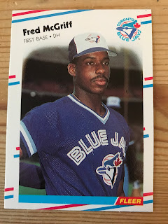
neighborhood that was selling Junk Wax dirt cheap. They had packs of 1988 Fleer
going for a quarter a piece. I wasn’t going to pass up 1988 Fleer for a quarter
a piece. So, I bought a wax box of them.
The
strange irony is, when The Hobby exploded in 2020, the owners of the sports
clothing store jacked the prices on all of their Junk Wax…a little too much.
Those 25-cent packs of 1988 Fleer are now going for three-dollars a pack.
NOPE.

I've heard people say better things about 1991 Fleer.
The
weird thing is…I have a lot of memories attached to 1982 Fleer. It’s the first
wax box I ever opened. I was still living in Wellsburg, West Virginia. I was
friends with this kid, Chris, who happened to be cousins with Joe Petini.
Petini was a reserve infielder for the San Francisco Giants. He played parts of
just a few seasons with them. Chris’ grandmother bought two boxes of 1982 Fleer
with the intent that Chris and I open them and find Joe’s card. Me, being the
Pirates fan I am, and not very good at understanding the task at hand, opened
up the Fleer packs, discarding every card that wasn’t a Pirates card.
Eventually Chris’ grandmother got hip to what I was doing, and took the cards
away from me to search for Joe’s on her own.
I
always wondered if I opened a pack with Cal Ripken Jr’s rookie card in it.
NEXT FRIDAY: We tackle Donruss in
the 1980s. My favorite to least favorite...and I'm really torn about which is my favorite.


I started collecting in earnest in 1987 (heck my first card ever was 1985 Fleer) and so all three brands should've been equals to me. But Topps was clearly the card of record. As soon as I realized it went back to the 1950s that die was cast. Probably one of the smartest things Topps did for my generation was to have the Turn Back the Clock cards in their 1986-1990 sets as a reminder of their history.
ReplyDeleteI didn't quite dismiss Fleer and Donruss but I never appreciated their esthetic either. There was always something more ephemeral about them. Looking back on things now I kind of treasure Fleer and Donruss’s "of their age" designs whether it's peak 1990s stuff like 1990 and 1991 Donruss or peak 1980s stuff like 1985 Donruss, 1988 Donruss, and 1988 Fleer. I also came to appreciate Fleer's photography and how ahead of the curve it was with silly/weird photos like those that came to dominate a lot of 1990s cards and which we now look back on as we look at sets with all-look-same action or posed photos.
It was really my old man who beat it into my head that Fleer and Donruss were "other." Not in bad way, but in a way that was a traditionalist's point of view. But, as a kid, I grabbed whatever was available. Mostly Topps. Sometimes Fleer. Rarely Donruss. Looking at these cards, I've gained a greater appreciation. Or I just can't see through the fog of youth.
ReplyDelete