
I’m a list guy.
I
don’t know about you but I’m one of those people who always look forward to
year-end lists. Best albums. Best songs. Best movies. Best TV shows. Best
books. Best Beatles albums in order from best to worst. I tend to eat those
lists up. Debate them…if I have a hat to throw into the ring. Make my own…at
least in my head. As intrusive as it is, I even like that Spotify makes up a
list of my listening habits for the year.
Countless
hours of the New Kids on the Block?
It
must be true.
With
my love of lists being stated here, I’m going to finish the year at Junk Wax
Jay by making some lists of my favorite cards of the 1980s. Why the 1980s? Because,
as a kid, I collected card from start to finish in that decade. Why another
list when there are so many lists? Simple. I’m working on a new novel. As much
as I love this blog it does take up the bulk of my two-hour writing morning,
before I have to go to the job. Making lists this month will allow me to get a
hard start on a project that I’ve been going back and forth with, but really
want to get going.
Plus,
lists are fun.
They’re
controversial.
Conversation
starters.
Using
card fronts only, this week I’m going to rank my favorite Topps baseball card
base releases from the 1980s. Next week I’m going to do Fleer. The week after,
Donruss. My rankings are going to be based on both the aesthetic value of the
card and on personal relationships with that year’s brand. I hope you enjoy.
Without
further ado…. the list:
1987 Topps:

This one is a no-brainer for me. Not only is 1987 my favorite Topps release from the 1980s, it ranks as one of my favorite releases of all-time, if NOT my actual favorite. And the Bo Jackson “Future Stars” card might be one of my favorite cards of all-time as well. What else can be written about those wood-grain borders? For me, I always found it interesting that in a year that both Fleer and Donruss tried to push their brands into the future (or at least stay current) that Topps decided to take a look back. Or at least wanted to give card-buyers more of a nostalgic feel. And they did so with amazing results.
I’ve written a lot
about 1987 brands of cards, and how they transport me back to a time and place.
1987 Topps does it for me each and every time. Of note, 1987 Topps are the
first brand that I was ever able to buy in wax box form with my own paper-route
money. I remember sitting on my living room floor and opening the box. Pulling
the star cards. Shoving the commons over to the side.
Life was much
simpler then.
1983 Topps:

1983 Topps is another one of those designs that not only are one of my favorites of the decade, but rank up there as one of my favorites of all-time. At the time they were released I was turning nine-years-old, and didn’t have much in the way of access to older Topps designs, so I couldn’t connect what they were doing with 1983 with its counter-part from 20 years ago, 1963. To me, they were a whole and original design. I loved the extra picture on the bottom of the card, and the way the double-colored borders really made the photos stand out. 1983 was the first year that I really remember wanting a lot of baseball cards.
If
you’ve been reading this blog then you know what happened to all of my cards
before 1984.
But 1983 Topps are
bittersweet for me. They remind me of loss. My family had just moved to a new
neighborhood that spring, and one of our neighbors took exception to the
barking of our dog. She was recently widowed and I guess she wasn’t sleeping
much. Not wanting to make waves in the neighborhood we’d just moved into, it
was decided to give the dog away. His name was Sparky. There’s a strange story
with Sparky. We had a dog before him named Sam, a Golden Retriever mix. Sam ran
away. Months after he did, someone found him and got in touch with my mom via
the information on Sam’s tags. But the dog she went to retrieve wasn’t Sam.
Someone had put Sam’s tags on Sparky.
Sparky might not
have been Sam, but by 1983 he’d been with us for a good year. Obviously, I was
upset about us having to give him away. Especially because of some old bat,
whom, I should add, had a pain-in-the-ass dog of her own, who spent years
barking at us kids whenever we played ball on the cul de sac. But I wasn’t
captain of my own ship back then. Am I even know? That said, in order to quell
the sadness both my brother and I felt, my mom bought us packs of 1983 baseball
cards. It wasn’t quite compensation, but we didn’t have much money.
And what else could
she do?
I chose Johnny Ray because he was probably my favorite player at the time.
1980 Topps:

The year is sentimental to me as a collector. 1980 Topps baseball cards are the very first packs of cards that I opened in pack form. The old corner store on Butler Street in the Lawrenceville section of Pittsburgh. My grandma bought the pack for me. In that first pack I pulled out my first Pirates card ever. Catcher Ed Ott. This is the design that started it all folks. An obsession that I would cater to for an entire decade, and a hobby that I would ultimately come back to time and time again and again and again and again. That nostalgia and sentimentality might cloud my judgement a bit. But I genuinely do think 1980 Topps are one of the brand’s best designs of the decade.
I’m
a huge fan of the team banner on the bottom of the card, and the position
banner on top. They’re classic. But what does “classic” mean. I guess it means
1980 Topps screams baseball card. Maybe Topps meant it that way, considering
this would be the last year in a LONG time that they would be the sole
manufacturer of cards. It was enough to get me hooked.
I chose the Mike
Schmidt card because, in 1980, it seemed like the Phillies were everywhere to
me. They were division rivals to my Pirates. They were making a run at the NL
East, a division the Buccos won the year before. The Phillies would win the
World Series.
If I was learning
what it meant to be a fan of a team in 1980, I was also learning about rivals.
I was learning to dislike the Philadelphia Phillies. And no one typified the
Phillies more to me than Mike Schmidt. I hated the Phillies. I hated Mike
Schmidt. I was in attendance for his 500th home run and wouldn’t
even applaud him. That’s how much my fandom was deep. It seems funny now. The
Pirates and Phillies haven’t been in the same division for almost 25-years.
And I actually
collect Schmidt cards now.
1984 Topps:

A design so nice, Topps said let’s do it twice. Although 1984 Topps isn’t a retread of 1983 they do, again, use a secondary photo on the bottom of the card. The 1984 design is plainer than the 1983 design. But that’s not necessarily a bad thing. The white borders give the card a crispness. I really do love the way the team’s name comes down the side of the card in bold letters.
1984
Topps looks almost like video game packaging.
And,
you know, Donny Baseball’s rookie card was in that set.
But
I chose Pete Rose’s card to show off with. It was a pretty simply decision.
First, the card is gorgeous. Pete in his Phillies baby blues smacking another
hit on his way to 4,000. And that was it in 1984. Pete Rose heading toward
4,000 hits and maybe even on his way to break Ty Cobb’s record. We all know how
that played out.
But
for me the Rose card invokes a memory. My parents went away for a week in 1984.
It was the first significant time that my brother and I spent away from our
parents. We stayed with my grandparents, which was fun and quirky in its own
way. A hot beverage with dinner? Afternoons at the local pub? Barnaby Jones
reruns? Sign me up. But what I remember is being in a Giant Eagle with my
grandma and coming across Topps rack packs. This would be when baseball cards
were showing up everywhere. I loved racks and cellos because you could actually
see some of the cards you were going to get. My grandma allowed my brother and
I each a rack pack, and I remember combing through them until I found one that
had the Pete Rose card on the top.
I
always think of that week when I see the Pete Rose card.
How
I was the luckiest kid in Giant Eagle.
1985 Topps:

If Topps took a step back in 1987, then maybe they went too far afield in 1985. Or the card typified the cultural zeitgeist at the time. Regardless, 1985 is Topps in the modern era. It’s Tears for Fears on the radio. It’s the Brat Pack card of the decade. It’s MTV. It’s neon bracelets out of gum ball machines. Teased hair. Swatch watch and Ray Ban shades. Madonna songs all day and night.
And call me a fan.
I even like those
green and pink card backs.
For
me, 1985 Topps is fun. It’s competition. The 1985 set was the first one I ever
tried to complete. Phineas was working on his as well. I’ve written about
competition and Phineas before. That year it became a moral imperil that I
complete the 1985 Topps set…and do it before he did.
I build sets now.
Too many. But I was never that kind of focused collector as a kid. I fell for
glitter and gold. I was more interested in individual cards of individual players.
Set building was work. And this girl just wanted to have fun. I didn’t complete
the 1985 set until 2020. Phineas had his completed by fall of 1985.
1985 Topps might've been 1980s fun...but I still wouldn't test Eddie Murray.
1989 Topps:

This is another classic design to me. Topps always has me at crisp, white borders where they allow the picture to do most of the work. And banners. Yes, banners were back on Topps baseball cards in 1989. Whether they did it consciously or not, Topps bookended the decade with banners. Maybe that was the plan?
And
I probably should talk about card backs with 1989 Topps. The black and dark
pink/red backs are a classic. And they just might glow in the dark. At that
time Bobby Bonilla was one of my favorite players. He was an all-star. And
Topps finally gave him a design that showed just how cool he looked swinging a
bat. Though I love his rookie cards, the 1989 Topps Bobby Bonilla is my
favorite of all of his cards.
I
try and think about where I was in 1989. I’d just completed my first year in high
school. And all-boys Catholic one. And I wasn’t very happy. I was overweight.
Obese maybe. I dug girls but they didn’t dig me. Baseball cards were really
solace for me in 1989. I was still slinging papers so I had money to buy them
on my own. But…1989 is really the last year that I remember being so very into
cards. My relationship with collecting would vastly change come the new decade.
And
1989 was supposed to be the Pirates breakout season. They were supposed to
build on the second-place successes of 1988 and make a run for the division.
But injuries plagued the team that year and they ended up in 5th
place. The 1989 baseball season was probably one of the most fraught and
fruitless and full of disappointment that I’d ever watched.
I
think of missed opportunities in 1989.
But
great things were right around the corner.
1981 Topps:

1981 was a tumultuous year for me, which I’ve only touched on in this blog. It was the year my family moved from Pittsburgh to West Virginia. A year in which I left the only home I’d ever known, at the impressionable age of seven. 1981 was a new home, a new state, a new town, a new school, and ultimately new friends. I cannot separate the cards from that year from the happenings of that year.
But
I really enjoy 1981 Topps all the same. They were doing the Score thing before
Score was even around. It’s certainly the most colorful set Topps went with
since 1975. And it works. I like that 1981 Topps has multi-colored borders. And
I’m a huge fan of the team cap at the bottom of the card. Maybe Topps felt that
they had to go big and bold in 1981, because this was the first year that their
monopoly ended and Fleer and Donruss were in the game.
The
Dave Parker card has always been a favorite of mine. Even though injuries and
other nonsense were coming, I feel like the card captures The Cobra at full
power. That big, green all-star stripe says it all.
And
maybe, just maybe, that’s John “The Hammer” Milner in the background.
1982 Topps:

I’m not really sure what I have to say about 1982 Topps. It’s not disco. It’s not new wave. Topps 1982 just is. It’s a very zen-like set if you look at it that way. I’m a fan of the hockey-stick border on the card. In fact, Topps using that in 2019 was one of my draws back into collecting and collecting base sets. I was gonna be a Heritage and Archives man until I saw that set. 1982 was also the last year that Topps used facsimile autographs on their cards. After that, you had to track the players down and get a real one yourself.
The
Willie Stargell card is an obvious favorite for me, if you’ve read at least one
of these blog posts. I have the same relationship to it as I do the 1984 Topps
Pete Rose. The first time I ever came across 1982 Topps was at a flea market,
shortly before my family moved back to the Pittsburgh area after that lost year
in West Virginia. 1982 was the first time I came across a cello pack.
I remember being shocked at the
fact that I could see the top card in a baseball card pack. What a revelation!
I’ve never been a fan of chance or the element of surprise, so seeing the top
card was absolutely in my wheelhouse. The dealer at the flea market didn’t seem
to mind when I began digging though the cello box, just to see who was on top
of each pack. I had me some little kid spending money, so I dug through until I
found the right cello pack for me. Until I found a pack with Willie’s card on
the top.
Willie
Stargell’s last Topps card.
1988 Topps:
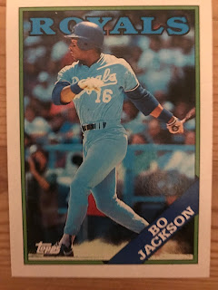
Coming on the heels of 1987, I don’t think I’ve ever been as disappointed with a card release as I was with 1988 Topps. And you can add Fleer and Donruss to that as well. And I was really excited for them initially. Actually, found my first wax box in Eide’s Music Store in downtown Pittsburgh during a field trip. Back when they had a walk-up location. I ripped the damn box the minute I got home, looking for my Pirates of course. Andy Van Slyke’s first base card in a Buccos uniform. But the cards left me meh. Yeah, I know Topps used some studio trickery 3-D stuff with their photos. But the design is bland and uninspired. And so are a lot of the photos.
Except
the one of Bo Jackson.
Topps
went back2back awesome on Bo in 1987 and 1988. As much as I don’t care for the
1988 Topps design, is as much as I love this card. Maybe it’s all of the blue.
Bo decked out in his baby blues. The blue team name. The blue border. Royals
fans in the stands wearing blue. But for a lackluster set this card really
stand out.
On
his much-missed (at least in my circle) Wax Ecstatic podcast, host Matt Sammon
took a second look at 1988 Topps and found that there was much to be
appreciated. I like Matt and I love and miss his podcast. But sadly, I don’t
feel any revisionist love for 1988 Topps.
1986 Topps:

How do you go from best to worst? How is one a heartthrob in your life at one point in time, and an ugly hag in another. This is what I think about when I think about 1986 Topps baseball cards. Man, I remember craving these things. I remember Dimitri Danielopoulus coming up to my house with the first 1986 Topps cards I’d see that year, and me offering to trade away anything for just one of them. D always had the new cards first. He had an older sister who would drive him out to the card shops in Monroeville, wherein the rest of us would have to wait for the cards to come to the local drug store. But I never wanted to wait. I was an impulsive moron who obviously didn’t realize the cards would be EVERYWHERE in a matter of weeks.
God,
the cards I traded away to D for 1986 commons!
I bought a
shit-ton of 1986 Topps baseball cards. Anywhere and everywhere, they were, I
was. I used allowance money. Odd job money. Found money. I used anything I
could to keep a constant stream of this brand coming into my possession.
What
can I say?
I
was twelve.
Cards
were my life.
But
now? Now…I have to admit that I’m not a fan of 1986 Topps. Maybe I’m a jerk and
it’s the lack of great rookies in the base set. The Pirates team set was full of has beens? The fact that starting with that year's Traded set and on, I'd have Barry Bonds and Bobby Bonilla (1987) in Buccos uniforms for the foreseeable future When I got back into collecting
with the intent of making sets of all the years I collected, I remember sitting
there opening 1986 Topps and feeling very…well…meh. I found myself wondering
what was the big deal back in 1986? Why was I willing to sell my card
collection soul to Dimitri Danielopoulus? For these? For these ugly, black and
white bordered, red backed drags?
Was
Vince Coleman’s rookie card that important to me?
No
wonder I love 1987 Topps.
It’s
an incredible oasis between two mediocre sets!
I
chose the Sam Khalifa card because Sammy was on the few bright spots on the 1985 Pirates. You wouldn't know it by his average, or the fact that he was out of Major League Baseball just a few short years later, but Sam Khalifa brought a little bit of hope to Pittsburgh. If there was one Pirates base set card that I wanted in 1986, it was Sammy's card. The card in pretty cool too. Sammy taking a lead off of second base back in good ol' Three Rivers Stadium.
That card is a way to acknowledge where the team I loved was, and ultimately where it was going to be heading over the next six seasons.
Thanks for reading! Happy collecting!
If you'd like to know more about the career and life of Sam Khalifa you can do so HERE and HERE. It's a pretty interesting yet sad tale.
Next Friday: We're counting down 1980s Fleer...best to worst!


Nice read! To me most of these designs were decent but some font and graphics choices are questionable. Over-familiarization with some cards (read junk wax) will negatively affect some collector's opinions but I like those junk wax designs just fine.
ReplyDeleteNow I'm curious as to which you find questionable. I don't usually consider font as questionable as others. I know a lot of people pitched a fit, and maybe rightfully so, over the 2021 base font
DeleteI love lists. Half my blog is lists. In fact I did this '80s countdown on my blog a loooong time ago, like back when Obama was president. 1983 Topps ruled that countdown and I'm in the 5 percent of collectors who thinks '88 is in the top 20 of designs Topps ever made. Also, '87 Topps can go to hell. (P.S.: Like the '81 Topps/Score comparison).
ReplyDeletei figured you'd have that reaction to 1987 Topps.
DeleteLove the list. It's always fun to read about the '80s sets. Looking forward to the Fleer and Donruss lists as well. I was wondering if you considered doing a subsets design list also? That would be a unique one with all the great ones from the 80s.
ReplyDeletelike what did you have in mind?
Delete