Friday, December 17, 2021

Ranking the 80's Part Three: Donruss Base


Donruss baseball cards in the 80s were the “other” brand to me.

It didn’t start out like that.

I had a ton of 1981 Donruss cards.

Then they disappeared until around 1987.

Most of the stores around my neighborhood didn’t carry them. The few that did were a bit too far away, or across some dangerous roads; rounds too dangerous for me to get to them.  And I was a kid always on foot. I was never handy with bicycles. I crashed bicycles all of the time. Probably wouldn’t be here now if I continued to ride bicycles.

We have a convenient bicycle program here in New York City.

Sometimes I think about taking a bicycle.

My wife knows my history with bicycles.

Because of that, I remain a middle-aged man on foot.

I guess, if one really tried, like I’m going to do here, you could say my relationship to Donruss cards were a bit like my relationship to bicycles. Fraught and estranged. True, prior to 1987 (more likely 1988), I did see Donruss cards. Phineas had them. The American Coin sold them. But it didn’t make sense to buy Donruss. Any little bit of cash that I had was already going to Topps cards. To a lesser extent Fleer. When I came across Donruss, it didn’t make sense to just buy a pack or two, when they didn’t seem to jell with what I was collecting overall.

Donruss was probably the first brand that I bought primarily in single-card format.

Until 1988…when that shit was everywhere.

That is to say, all these years later, I’m still a little wowed by 1980s Donruss. Designs that have been in circulation for almost forty-years (some not all, but especially 1984-1985 Donruss), still feel new or exotic to me. I’d been wondering if I should even rank Donruss cards because of this fact. But I’m going to because even if something still feels a touch odd to you, you can still have a visceral reaction to it.

Case in point.

I listened to Ryan Adams’ cover album of Taylor Swift’s 1989 exactly once.

And I knew enough about it in one listen.

That’s not a dig on Taylor Swift.

That’s a dig on Ryan Adams.

So I’m going to go ahead and rank 1980s Donruss Baseball from my favorite to least favorite. Why not? It’s just an opinion. Everyone has an opinion.

And you know what they say about opinions, right?

Let’s get into this, shall we?

1987 Donruss:


Yeah…I know…me and my 1987 fixation.

I’m doomed to never escape that thirteen-year-old boy.

But 1987 Donruss is truly a grand card. First of all, there’s the black border. A black border on baseball cards! Topps did black border in 1971 and, unless you really want to count 1986, they wouldn’t touch black borders again until 2007. Donruss did black borders twice in the same decade, mofo. And, yes, I know a black border makes it harder to keep the card in mint condition, but black borders are the shit. 

I think it’s worth to take the chance on black borders in some instances.

1987 Donruss is one of those instances.

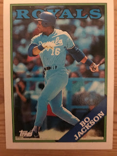
It’s a classic and classy design from the company. Aside from the border, I always loved those two golden baseball bars bookended by bold yellow. That simple red bar for the players name and position. The Bo Jackson card is one of my favorites in the set. The blue of his Royals uniform really makes everything else about the card stand-out. 

It has that classic Rated-Rookie stamp on it.

If the 1987 Topps Bo Jackson card didn’t exist, this would be my favorite of his rookie cards.

Just a damn fine design for the company.

I might like 1987 Topps and Fleer better, but 1987 Donruss is breathing down their necks.

1984 Donruss:


        I sometimes take this Pete Rose card out just to look at it. Charlie Hustle has a lot of iconic cards, and I think this is Donruss entry into that lore. And they picked one hell of a design to do it with. Most would say 1984 Donruss is their first great design, after being bogged down in mediocrity or a lack of inspiration since their debut in 1981. The 1984 design is given over almost entirely to the photograph. There’s just a thin white border, and a small band of red at the bottom of the card for the player’s name and position.

It’s not 1987.

But it doesn’t have to be.

It’s 1984 Donruss.

The first year of the Rated Rookie, if I’m correct.

Honestly, if I were exposed more to 1984 Donruss as a kid, this design would be my favorite. But sentimentality and connection play a park in my rankings. And I don’t think I opened a single pack of 1984 Donruss back then. Never held the Don Mattingly rookie in my hands. Phineas had 1984 Donruss. I don’t know where he got them from, but he never disclosed the location to me. Very Phineas. The only 1984 Donruss that I had was a Pirates team set that I got at the American Coin.

I have very few 1984 Donruss now.

I’d like more.

1989 Donruss:


No one asked for my opinion, but if you’re reading this you must at least care about it a little bit; but if we’re picking our favorite Ken Griffey Jr. rookie card then 1989 Donruss is mine. You can keep the Score update and Topps traded. And the 1989 Bowman too. 1989 Upper Deck is iconic. But so what? The 1989 Donruss Ken Griffey Jr. is gorgeous. As a fifteen-year-old kid I didn’t know I needed all of that blue, black and purple bleeding into my life, until I got that Griffey card.. In fact, 1989 Donruss in general are just gorgeous cards.

Don’t believe me?

How about this?


I’ll forever think that orange, green, yellow, and black are workable colors together.

Or else Eddie Murray just has me thinking back to Halloween.

Eddie Murray doesn’t make a bad baseball card.

Find a bad Eddie Murray baseball card, and I’ll still tell you why its cool.

Regardless, 1989 Donruss could’ve been a mess. Cards with multiple colors can sometimes be a mess. Especially colors that continuously fade into each other. Had we even seen a design similar to what Donruss was doing in 1989?  1989 Donruss was on the forefront of something. The colors bleed perfectly into one another. The photography is great. I have so many favorites from this set.

1989 Donruss make 1990 Donruss all the more tragic.

Want an interesting fact about me and 1989 Donruss.

Back in 1989, I got the Griffey card in the very first pack of Donruss that I opened. I was on an escalator in the Monroeville Mall. I’d bought my packs at the G.C. Murphy’s on the first floor. Even though 1988 Donruss were a ubiquitous presence in my life, in 1989 the excitement of seeing Donruss in the wild was still embedded in my collecting psyche. But…it was stupid of me to open a pack while I was out, with nothing on me to keep a star card safe. But, in my defense, I wasn’t expecting to get The Kid in my very first pack.

At fifteen I was more than familiar with my luck.

Flash forward thirty years. It’s the fall of 2019 and I bought myself a wax box of 1989 Donruss online. I’m new back into The Hobby. I have this grand design to hand collate every single base set from every single brand of my youth. Screw writing novels. Screw writing poetry. Collecting my youth was going to become my life’s work. 1989 Donruss would soon be mine!

So, I open up the first pack in the box. 

Guess who was in that pack?

1985 Donruss:


Donruss’ first foray into a black border is a pretty solid card. And while it’s not 1984, at least the company didn’t backslide after making such progress. Again, Donruss lets the photography speak for itself. The black border isn’t as thick as 1987. There’s not a bar of gold on each side. There are these unnecessary red stripes on the bottom of each side of the border, that take away more than add to the card design. But I feel like the 1980s had a lot of unnecessary splashes of color. Also, Donruss seems to really love using a simple red bar to give you player/position information.

1985 would be the last year Donruss would use its original logo.

Like 1984, I don’t recall opening any packs of 1985 Donruss. I can’t find an honest to goodness connection 1985 Donruss. At best I had another Pirates team set, but I don’t really even recall that. 1985 Donruss is the Donruss I was talking about in the beginning as still being strange and/or exotic to me. Just really the one design that completely passed me by as a collector in my youth. When I see it, or when I buy a card from my PC, I’m always like, oh, yeah, 1985 Donruss! 

Al Oliver is one of those players I PC.

Scoop should be in the Hall of Fame.

And Eddie Murray was still the shit in 1985.


*This is going to get tougher now*

1988 Donruss:


Matt Sammon, on his Wax Ecstatic Podcast (which I still miss the shit out of) called 1988 Donruss the red-headed stepchild of Junk Wax…and that’s saying a lot because of how ubiquitous Junk Wax Era cards were…and still are. But that statement is not incorrect. If I had a hard time finding Donruss prior to 1988; I found 1988 Donruss everywhere I went.

I think my church even had them.

I kid.

I think.

But 1988 Donruss really seemed to be anywhere and everywhere. And, I guess, if you can point to one design and immediately think “junk wax,” it might as well be 1988 Donruss. But, for guys like me, back then it was exciting to come across 1988 Donruss. And because I’d had such a hard time finding Donruss before, I made sure I bought a ton of of them. 

And the design? It’s not…bad? I actually kind of like it. I like the cool-feeling blue borders, although I’m not too certain about the Kerouacian flannel prints. Simplicity never seems to be enough for the Donruss company. They seem to have a habit of taking a simple border and adding a splash of something, a line here, a patch of color there, that just makes you shake your head, and wonder why.

Check 1991 Donruss for reference.

I think the availability of 1988 Donruss lowers its esteem a little bit. I’ve said it a few times in these rankings, but for everything Topps, Fleer and Donruss did right in 1987, they did the exact opposite in 1988. Do I think 1988 Donruss is better than 1988 Topps or Fleer? No. But it’s just as uninspired.

And the pictures are kind of fuzzy.

1986 Donruss:


I was debating flip-flopping 1986 and 1988 Donruss. The only reason 1988 stands above 1986 for me is the fact that 1986 Donruss, like 1985 and 1984 before it, was very hard for me to get. Again, I do not recall opening a single pack of 1986 Donruss. But like any hot-blooded twelve-year-old, I wanted 1986 Donruss. I wanted 1986 Donruss cards so badly. 

And I think you all know why. 

Let’s just say the only way I saw the Canseco rookie card was either on the cover of a baseball card magazine, or under a glass showcase at a card show, being sold for an astronomical amount.

Canseco’s shared Fleer rookie, with fucking Eric Plunk, was just never gonna cut it.

And what’s to say about the 1986 design itself? Like 1985 Topps, I feel that 1986 Donruss is very of its time and place. It’s very 80s. Check out those jazzy tilted photos. I feel so MTV looking at 1986 Donruss. Donruss also decided, screw it, instead of adding splashes of pattern to the border, let’s just muck the whole thing up with lines. The card border looks like an old snowy TV set. I want to grab my antennae when I see 1986 Donruss.

I’m really showing my age here, aren’t I?

I actually have a few stacks of 1986 Donruss. Found them very cheap at an antique store earlier this year. I thought maybe it would be a fun set to casually try to put together, and give myself an actual reason to buy the Canseco rookie for reasons other than trying to fill the void left by an unquelled desire. Also, I seem to be leaning back toward my original collecting goal of putting together all of the sets of my youth. 

Because I have this bottomless Jay Gatsby fixation on repeating my past.

But considering what I said above.

Is 1986 Donruss really OF my past?

        Also....Andre Dawson doesn't make a bad card either.

1982 and 1983 Donruss:


I’m lumping these two designs together. They’re essentially the same design. Take away the angled borders and round them out, turn the Donruss logo from a rectangle to a square, make the ball into a bat, reverse said bat and, Walla, 1982 Donruss morphs right into 1983 Donruss. 

And truth be told, I probably like these designs better than 1986 and 1988. The Johnny Ray rookie here is my favorite of his rookie card. Granted, his Topps card is shared with two other players, including Vance Law, who seemed to show up in every single pack of cards that I bought from 1982-1989. And Ray’s other rookie card is, well, 1982 Fleer. But I think Donruss had something going with their photography in 1982 and 1983. The photos seem crisper than Topps. Brighter than Fleer. In essence, 1982 and 1983 Donruss showed that the fledgling company could do good things if they wanted to.

But I can’t get over the laziness.

I get up to write every weekday morning at 4:45.

You lose points on this blog for laziness.

You were being lazy Donruss.

        And add The Cobra to the list of guys who make baseball cards look cool.

1981 Donruss:


I feel like I’m supposed to put 1981 Donruss last. With the haphazard and quickly collected photos and the error cards, the duplicate cards of players (case in point, these Willie Stargell cards. For years I only knew of the tired, trucker-hat Stargell card. I didn’t know there was a Willie in his Pittsburgh-gold uniform playing first base version of a card),1981 Donruss needs to be last. Hey, you wanted to put out a product with little time to do it, and I, as the demanding consumer, get to judge. 

That’s how capitalism works, right? 

But, point of fact, I don’t mind 1981 Donruss all that much. Yeah, it’s the template for the next two years of basically the same design. But I still think they’re kind of sharp.

Or maybe 1981 Donruss plays on my emotions. I’ve talked a lot about having trouble finding Donruss cards in the early to mid-80s. But I had a TON of 1981 Donruss. I’ve mentioned it here before, but in May of 1981 my family moved from Pittsburgh to Wellsburg, West Virginia. Wellsburg is maybe an hour away from Pittsburgh, but to seven-year-old me, it might as well have been across the country. I was pulled out of school weeks before the year ended. I left the only home I knew. The only friends I knew.

I was sad.

To make up for the sadness, my grandma bought me a ton of packs of cards to open on the drive to my new home, my new life.

Something to make me happy.

Something to make me smile.

She bought me 1981 Donruss cards.

And, yeah, the design sucks. The backs suck. There are errors. The cards were rushed.

But 1981 Donruss will always have a special place in my heart.


Thanks for reading! Happy collecting!

Junk Wax Jay is going on a 2 week hiatus for the holidays...so...Happy Holidays to all of you, and please try and be as safe and healthy as you can with both Delta and Omicron coming at us. Get Vaccinated! Get your Booster! See you all again on Friday, January 7, 2022! 


Friday, December 10, 2021

Ranking the 80's Part Two : Fleer Base


This is going to sound crazy.

            Maybe even sacrilegious to some in the collecting world.

            But I’ve always considered brands like Fleer and Donruss to be also-rans. And that doesn’t made sense. Fleer and Donruss showed up a year into my collecting life. I was seven. Seven-year-olds don’t even also-rans. A lot of stuff is still new to seven-year-olds. Hell, in 1981, I didn’t even know that Fleer and Donruss weren’t making cards.

            Yet I can’t shake that feeling whenever I see Fleer or Donruss cards.

            Also-rans.

Maybe I drank the Kool-Aid and believed Topps when they said they were “The Real One.” Parents are a big influence too. My old man wasn’t a card collector, and probably thought the money he’d seen me and my brother waste on them as profligate or less-than-smart. But my old man had opinions. And he liked to share them. If he commented on our card-collecting habits at all, aside from the money we were wasting on them, it was to let me and my brother know that Topps really was “the real one.”

Because they were the only cards around when he was a kid.

And everyone knows that their generation is the best, right?

So, I always had this sense of “other” with Fleer and Donruss. To be even more honest, the “otherness” is more geared toward Donruss than Fleer. Fleer cards were actually pretty present in my life during the 1980s. They were available from the get-go. The first wax box I ever opened was 1982 Fleer. Revco drugs had them. If I wanted Donruss I had to risk life and limb cross the intersection at Beulah and Frankstown Road, to get to Statlander Pharmacy. And anyone reading this from Penn Hills knows what I’m talking about. We all knew someone who was in a car accident at that intersection.

I wasn’t risking my life for Donruss.

But we’ll get to Donruss next week.

Last week when I ranked Topps I ranked them best to worst. With words, and how one uses words, being of the utmost importance these days, I fear I misspoke. You see, I’m just a jerk who collects baseball cards. I’m no expert. I couldn’t honestly tell you what the best to worst baseball card of a brand in a decade is. In essence, I used the wrong words. What I should’ve said is that I’m ranking Topps, Fleer and Donruss cards of the 80s by MY favorite design to least favorite design.

So that’s how we’ll consider these ranking blog posts from this point on.

One collector’s humble opinion.

 1987 Fleer:

            I recently wrote a blog post about 1987 Fleer baseball cards, so excuse me if I get a bit redundant here. But, if 1987 Topps did not exist, 1987 Fleer would not only be my favorite Fleer design of the decade, but also my favorite baseball card design of any brand in the 1980s. I’m an absolute fan of everything Fleer was doing with this design, from the icy-blue borders that fade into white, to the icy-blue bar that resurfaces at the bottom of the card. 1987 IS my wheelhouse. I love the 3-D like design of the player image, the way a bit of the photo pops out onto the border. And I love the simplicity of where Fleer places its brand name in juxtaposition to the team logo.

            1987 Fleer brings back so many memories. The turn-of-the-century Jim Leyland helmed Pirates lead by Barry Bonds, Bobby Bonilla and Andy Van Slyke, vying for respectability in the NL East. Summer evenings sitting on my bed, going through these cards. 1987 Fleer reminds me of how further my reach was in collecting. The ability to walk further out of my neighborhood to seek these out. Going to card shows.

            My God, how they bring me right back to my youth.

 1983 Fleer:

            1983 Fleer and the next design we’ll discuss could almost be interchangeable for me on this list, as I love them both. 1983 Fleer gets the edge for personal reasons. But the design itself is fantastic. I love that the border is gray. That it’s a wide gray that still allows for a good size player picture. And how about those pictures. Everything about 1983 reminds me of early baseball. Those April games where its still a bit cold out, and there’s a chance for rain. Maybe it’s the Stargell card that invokes that feeling for me. Willie looks like he’s cold. Like someone snapped a photo of him during the end of a rain delay. A lot of 1983 Fleer look like the Stargell card. They’re close-up photo. Intimate.

            Really just the first great set Fleer produced and they hit it out of the ballpark.

            The Stargell card is special to me. Only Fleer and Donruss gave Pops a card in 1983 as a way to cap off his career and show his full stats. Topps, who tends to milk everything, really missed the ball a lot with end-of-career cards. Not only Stargell. Willie McCovey was given a 1981 Fleer. Johnny Bench and Yaz were giving career send-offs in 1984.

            I’m sure there are others.

            1983 Fleer feels like independence to me. My independence. My family had just moved to a new neighborhood. I didn’t know anyone yet. I hadn’t met A.J. yet, and wouldn’t meet Miller until later that summer. So, I was alone a lot, or it was me and my brother. At nine I was deemed old enough to be able to walk to the Thrift Drug in the Ritzland Shopping Plaza or Revco that sat atop Penn Oak Drive. Thrift had 1983 Topps. Revco had 1983 Fleer. And I spent a lot of change buying both.

            But…those cards met a sad ending.

 1985 Fleer:

            There wasn’t a lot of color in baseball card borders for us 1980s kids. We were too young to experience 1975 Topps, and it seemed like Topps had settled down after that experiment. Fleer and Donruss were just trying to put out cards that weren’t rife with errors. But in 1985 the game changed. If 1985 Topps is the MTV card of the decade, Fleer is the VH-1. You get two borders for the price-of-one. A fine gray border, that has proven difficult to keep in mint-condition over the ensuing years, and an awesome color border that tended to coincide with the team color. Again, the Fleer brand name is understated and doesn’t interfere with the design, and they just seem to know where to place a team logo.

            1985 Fleer has the distinction of being the first pack of baseball cards that I ever stole. Yeah. I was going though a bit of a thievery phase back then. Baseball cards. Action figures that someone had ripped out of the packaging in a Hills department store. What? It wasn’t like they could resell it. My old man caught me with the action figure, but I got away with my share of 1985 Fleer.

            Though stealing is wrong.

            My favorite 1985 Fleer card is the Pete Rose card. Though they are rival brands, I feel like the card is almost an homage to his 1974 Topps. I put the Gooden at the forefront A) Because its his base rookie card. B) Because it’s the first 1985 Fleer card that I bought when I returned to collecting. Got it at an indoor flea market in December 2019. I was with my brother. This was weeks before Covid would start making its way into our lives. I wouldn’t see him or that Flea Market again until April 2021.

 1984 Fleer:

            1984 Fleer is all business to me. Plain white border with a navy stripe at the Top and at the Bottom. It’s the 2nd great set that Fleer put out, and is a bona fide classic from my point-of-view. And to show you just how awesome baseball card product was in 1984, it’s my least favorite of the three brands. But that takes nothing away from the card. Any chance I get to get my hands on some 1984 Fleer I’ll take.

            Strangely, though, 1984 Fleer cards don’t invoke many memories for me. I’m sure I bought my share. But I can’t conjure up a time or place, like I can with Topps, or the yearning that I had for 1984 Donruss.

            So, we’ll leave 1984 Fleer where it is.

            Just a great-looking card.

 1986 Fleer:

            Why wasn’t I clamoring for more of these in 1986? Why had I wasted so much money on Topps, and gave 1986 Fleer only a passing glance. And we know that by “passing glance” in the Junk Wax Era, it means I bought a shit-ton but didn’t spend nearly as much time on them as I did on Topps.

            But look at 1986 Fleer! Look at that way it shines. The crisp dark blue border. That thin surrounding white. That elongated raindrop drip of color at the bottom that houses the team logo, the player’s name and position all in one burst. If 1986 Topps has fallen from grace for me, then 1986 Fleer has risen to reverence in my view.

            Again, that’s not to say I didn’t buy my share. If I previously complained about Topps’ failure to give a player a proper final card, they also dropped the ball on a number of key rookie cards in the 1980s. With the exception of Ken Griffey Jr in 1989, none are more glaring than omitting Jose Canseco from their 1986 base set. A kid had to turn to Fleer and Donruss for Jose’s rookie. The most famous and classic of the two is the Donruss. But Donruss was hard to find for me. So, I settled on Fleer.

            And…the card is all right.

            It’s a shared rookie card.

            With Eric Plunk.

            Who seemed to show up in every other baseball card pack I opened in the late 1980s.

            Sadly, I don’t currently have Jose Canseco’s 1986 Fleer rookie. In fact, I don’t have much in the way of 1986 Fleer. Which is shame. I’d actually like to build the set. But 1986 Fleer has gotten pricey. The Steve Carlton card above, I got out of a dime box at a card shop in Buffalo back in April. You wanna sell me one of Lefty’s cards for a dime? You got it buddy!

 1989 Fleer:

            I don’t know if I’m so much a fan of 1989 Fleer as I am of the Ken Griffey Jr. card. Upper Deck might have icon status where The Kid’s rookie card is concerned, but Junior’s Fleer and Donruss cards look waaaaaaayyyyyy better. I can’t get over how young The Kid looks here. I can’t get over those cool Mariner’s uniforms.

            As for the design? I don’t really know what Fleer was going for her. I like the gray. I like that the cards have angular edge to them. There’s that player image coming out of the card again. But white stripes on the card? On a baseball card? They look like someone’s pajamas. Or, worse, prison bars.

            I guess if we’re talking about 1989 Fleer, I have to mention the Billy Ripken “Fuck Face” card. I remember the controversy over that. I remember kids clamoring for the card. Overweight men with bad mustaches and coffee-breath trying to rip kids off at card shows for the card. Truth be told, I never cared one way or the other about the Ripken card and its variants. Or error cards in general. I’m not a fan.

            An error is a mistake.

            And a mistake is just a kind way of saying you fucked up.

            Or in this instance, you fuck-faced up.

 1981 Fleer:

            And talk about fucking up. Fleer’s debut was full of errors. Fernand Valenzuela anyone? But 1981 Fleer aren’t bad looking cards, even if they don’t use team logos. There’s a plain simplicity to them. Maybe that’s because Fleer had to rush production after Topps lost its monopoly. Hence the errors.

            But I like 1981 Fleer’s white borders. Like the round border that surrounds the player’s image. I even like the script team name. 1981 Fleer brings back a lot of memories. Of being in flux. I bought my first packs of 1981 Fleer at corner stores in Pittsburgh, and a month or so later my old man was buying me packs at a convenience store a block away from what would be my new school in Wellsburg, West Virginia.

            I don’t have much in the way of 1981 Fleer, other than some Pirates cards. This Ricky Henderson was actually given to me by fellow poet and collector Steve Brightman. We got to DMing on Twitter one day when I got back into collecting. We were talking about anxiety and how getting back into collecting helped quell some of it. Steve sent me some cards to get my new collection going. The Rickey is a part of what he sent.

            Thanks Steve.

 1988 Fleer:

            I’m either just picky or no one made a baseball card I liked in 1988. At least not between Topps, Fleer and Donruss. Maybe that’s why I like 1988 Score so much. At least their debut cards looked interesting with their colored borders. I don’t realty know what Fleer was trying to do with this The busy red and blue stripes all over. That borderless top of the card. It’s like they were doing so much just to make the card seem dull.

            But I’m a slave to the Junk Wax Era. There’s a sports clothing shop in my neighborhood that was selling Junk Wax dirt cheap. They had packs of 1988 Fleer going for a quarter a piece. I wasn’t going to pass up 1988 Fleer for a quarter a piece. So, I bought a wax box of them.

            The strange irony is, when The Hobby exploded in 2020, the owners of the sports clothing store jacked the prices on all of their Junk Wax…a little too much. Those 25-cent packs of 1988 Fleer are now going for three-dollars a pack.

            NOPE.

 1982 Fleer:

            You had to know this one was inevitable. What is there to say about 1982 Fleer that hasn’t already been said? That its one of the worst sets ever produced? That no one seemed to care about design. Or photos that were in focus. Or too shaded. If you want to sum up 1982 Fleer, just Google the Jack Morris card, and that’ll show you all you need to know.

            I've heard people say better things about 1991 Fleer.

            The weird thing is…I have a lot of memories attached to 1982 Fleer. It’s the first wax box I ever opened. I was still living in Wellsburg, West Virginia. I was friends with this kid, Chris, who happened to be cousins with Joe Petini. Petini was a reserve infielder for the San Francisco Giants. He played parts of just a few seasons with them. Chris’ grandmother bought two boxes of 1982 Fleer with the intent that Chris and I open them and find Joe’s card. Me, being the Pirates fan I am, and not very good at understanding the task at hand, opened up the Fleer packs, discarding every card that wasn’t a Pirates card. Eventually Chris’ grandmother got hip to what I was doing, and took the cards away from me to search for Joe’s on her own.

            I always wondered if I opened a pack with Cal Ripken Jr’s rookie card in it.

 Thanks for reading! Happy collecting!

NEXT FRIDAY: We tackle Donruss in the 1980s. My favorite to least favorite...and I'm really torn about which is my favorite.


Friday, December 3, 2021

Ranking the 1980s Part One : Topps Base


I’m a list guy.

            I don’t know about you but I’m one of those people who always look forward to year-end lists. Best albums. Best songs. Best movies. Best TV shows. Best books. Best Beatles albums in order from best to worst. I tend to eat those lists up. Debate them…if I have a hat to throw into the ring. Make my own…at least in my head. As intrusive as it is, I even like that Spotify makes up a list of my listening habits for the year.

            Countless hours of the New Kids on the Block?

            It must be true.

            With my love of lists being stated here, I’m going to finish the year at Junk Wax Jay by making some lists of my favorite cards of the 1980s. Why the 1980s? Because, as a kid, I collected card from start to finish in that decade. Why another list when there are so many lists? Simple. I’m working on a new novel. As much as I love this blog it does take up the bulk of my two-hour writing morning, before I have to go to the job. Making lists this month will allow me to get a hard start on a project that I’ve been going back and forth with, but really want to get going.

            Plus, lists are fun.

            They’re controversial.

            Conversation starters.

            Using card fronts only, this week I’m going to rank my favorite Topps baseball card base releases from the 1980s. Next week I’m going to do Fleer. The week after, Donruss. My rankings are going to be based on both the aesthetic value of the card and on personal relationships with that year’s brand. I hope you enjoy.

            Without further ado…. the list:


1987 Topps:


            This one is a no-brainer for me. Not only is 1987 my favorite Topps release from the 1980s, it ranks as one of my favorite releases of all-time, if NOT my actual favorite. And the Bo Jackson “Future Stars” card might be one of my favorite cards of all-time as well. What else can be written about those wood-grain borders? For me, I always found it interesting that in a year that both Fleer and Donruss tried to push their brands into the future (or at least stay current) that Topps decided to take a look back. Or at least wanted to give card-buyers more of a nostalgic feel. And they did so with amazing results.

I’ve written a lot about 1987 brands of cards, and how they transport me back to a time and place. 1987 Topps does it for me each and every time. Of note, 1987 Topps are the first brand that I was ever able to buy in wax box form with my own paper-route money. I remember sitting on my living room floor and opening the box. Pulling the star cards. Shoving the commons over to the side.

Life was much simpler then.


1983 Topps:


            1983 Topps is another one of those designs that not only are one of my favorites of the decade, but rank up there as one of my favorites of all-time. At the time they were released I was turning nine-years-old, and didn’t have much in the way of access to older Topps designs, so I couldn’t connect what they were doing with 1983 with its counter-part from 20 years ago, 1963. To me, they were a whole and original design. I loved the extra picture on the bottom of the card, and the way the double-colored borders really made the photos stand out. 1983 was the first year that I really remember wanting a lot of baseball cards.

            If you’ve been reading this blog then you know what happened to all of my cards before 1984.

But 1983 Topps are bittersweet for me. They remind me of loss. My family had just moved to a new neighborhood that spring, and one of our neighbors took exception to the barking of our dog. She was recently widowed and I guess she wasn’t sleeping much. Not wanting to make waves in the neighborhood we’d just moved into, it was decided to give the dog away. His name was Sparky. There’s a strange story with Sparky. We had a dog before him named Sam, a Golden Retriever mix. Sam ran away. Months after he did, someone found him and got in touch with my mom via the information on Sam’s tags. But the dog she went to retrieve wasn’t Sam. Someone had put Sam’s tags on Sparky.

Sparky might not have been Sam, but by 1983 he’d been with us for a good year. Obviously, I was upset about us having to give him away. Especially because of some old bat, whom, I should add, had a pain-in-the-ass dog of her own, who spent years barking at us kids whenever we played ball on the cul de sac. But I wasn’t captain of my own ship back then. Am I even know? That said, in order to quell the sadness both my brother and I felt, my mom bought us packs of 1983 baseball cards. It wasn’t quite compensation, but we didn’t have much money.

And what else could she do?

I chose Johnny Ray because he was probably my favorite player at the time.


1980 Topps:


            The year is sentimental to me as a collector. 1980 Topps baseball cards are the very first packs of cards that I opened in pack form. The old corner store on Butler Street in the Lawrenceville section of Pittsburgh. My grandma bought the pack for me. In that first pack I pulled out my first Pirates card ever. Catcher Ed Ott. This is the design that started it all folks. An obsession that I would cater to for an entire decade, and a hobby that I would ultimately come back to time and time again and again and again and again. That nostalgia and sentimentality might cloud my judgement a bit. But I genuinely do think 1980 Topps are one of the brand’s best designs of the decade.

            I’m a huge fan of the team banner on the bottom of the card, and the position banner on top. They’re classic. But what does “classic” mean. I guess it means 1980 Topps screams baseball card. Maybe Topps meant it that way, considering this would be the last year in a LONG time that they would be the sole manufacturer of cards. It was enough to get me hooked.

I chose the Mike Schmidt card because, in 1980, it seemed like the Phillies were everywhere to me. They were division rivals to my Pirates. They were making a run at the NL East, a division the Buccos won the year before. The Phillies would win the World Series.

If I was learning what it meant to be a fan of a team in 1980, I was also learning about rivals. I was learning to dislike the Philadelphia Phillies. And no one typified the Phillies more to me than Mike Schmidt. I hated the Phillies. I hated Mike Schmidt. I was in attendance for his 500th home run and wouldn’t even applaud him. That’s how much my fandom was deep. It seems funny now. The Pirates and Phillies haven’t been in the same division for almost 25-years.

And I actually collect Schmidt cards now.


1984 Topps:


            A design so nice, Topps said let’s do it twice. Although 1984 Topps isn’t a retread of 1983 they do, again, use a secondary photo on the bottom of the card. The 1984 design is plainer than the 1983 design. But that’s not necessarily a bad thing. The white borders give the card a crispness. I really do love the way the team’s name comes down the side of the card in bold letters.

            1984 Topps looks almost like video game packaging.

            And, you know, Donny Baseball’s rookie card was in that set.

            But I chose Pete Rose’s card to show off with. It was a pretty simply decision. First, the card is gorgeous. Pete in his Phillies baby blues smacking another hit on his way to 4,000. And that was it in 1984. Pete Rose heading toward 4,000 hits and maybe even on his way to break Ty Cobb’s record. We all know how that played out.

            But for me the Rose card invokes a memory. My parents went away for a week in 1984. It was the first significant time that my brother and I spent away from our parents. We stayed with my grandparents, which was fun and quirky in its own way. A hot beverage with dinner? Afternoons at the local pub? Barnaby Jones reruns? Sign me up. But what I remember is being in a Giant Eagle with my grandma and coming across Topps rack packs. This would be when baseball cards were showing up everywhere. I loved racks and cellos because you could actually see some of the cards you were going to get. My grandma allowed my brother and I each a rack pack, and I remember combing through them until I found one that had the Pete Rose card on the top.

            I always think of that week when I see the Pete Rose card.

            How I was the luckiest kid in Giant Eagle.


1985 Topps:


               If Topps took a step back in 1987, then maybe they went too far afield in 1985. Or the card typified the cultural zeitgeist at the time. Regardless, 1985 is Topps in the modern era. It’s Tears for Fears on the radio. It’s the Brat Pack card of the decade. It’s MTV. It’s neon bracelets out of gum ball machines. Teased hair. Swatch watch and Ray Ban shades. Madonna songs all day and night.

And call me a fan.

I even like those green and pink card backs.

            For me, 1985 Topps is fun. It’s competition. The 1985 set was the first one I ever tried to complete. Phineas was working on his as well. I’ve written about competition and Phineas before. That year it became a moral imperil that I complete the 1985 Topps set…and do it before he did.

I build sets now. Too many. But I was never that kind of focused collector as a kid. I fell for glitter and gold. I was more interested in individual cards of individual players. Set building was work. And this girl just wanted to have fun. I didn’t complete the 1985 set until 2020. Phineas had his completed by fall of 1985.

1985 Topps might've been 1980s fun...but I still wouldn't test Eddie Murray.


1989 Topps:


            This is another classic design to me. Topps always has me at crisp, white borders where they allow the picture to do most of the work. And banners. Yes, banners were back on Topps baseball cards in 1989. Whether they did it consciously or not, Topps bookended the decade with banners. Maybe that was the plan?

            And I probably should talk about card backs with 1989 Topps. The black and dark pink/red backs are a classic. And they just might glow in the dark. At that time Bobby Bonilla was one of my favorite players. He was an all-star. And Topps finally gave him a design that showed just how cool he looked swinging a bat. Though I love his rookie cards, the 1989 Topps Bobby Bonilla is my favorite of all of his cards.

            I try and think about where I was in 1989. I’d just completed my first year in high school. And all-boys Catholic one. And I wasn’t very happy. I was overweight. Obese maybe. I dug girls but they didn’t dig me. Baseball cards were really solace for me in 1989. I was still slinging papers so I had money to buy them on my own. But…1989 is really the last year that I remember being so very into cards. My relationship with collecting would vastly change come the new decade.

            And 1989 was supposed to be the Pirates breakout season. They were supposed to build on the second-place successes of 1988 and make a run for the division. But injuries plagued the team that year and they ended up in 5th place. The 1989 baseball season was probably one of the most fraught and fruitless and full of disappointment that I’d ever watched.  

            I think of missed opportunities in 1989.

            But great things were right around the corner.


1981 Topps:


            1981 was a tumultuous year for me, which I’ve only touched on in this blog. It was the year my family moved from Pittsburgh to West Virginia. A year in which I left the only home I’d ever known, at the impressionable age of seven. 1981 was a new home, a new state, a new town, a new school, and ultimately new friends.  I cannot separate the cards from that year from the happenings of that year.

            But I really enjoy 1981 Topps all the same. They were doing the Score thing before Score was even around. It’s certainly the most colorful set Topps went with since 1975. And it works. I like that 1981 Topps has multi-colored borders. And I’m a huge fan of the team cap at the bottom of the card. Maybe Topps felt that they had to go big and bold in 1981, because this was the first year that their monopoly ended and Fleer and Donruss were in the game.

            The Dave Parker card has always been a favorite of mine. Even though injuries and other nonsense were coming, I feel like the card captures The Cobra at full power. That big, green all-star stripe says it all.

            And maybe, just maybe, that’s John “The Hammer” Milner in the background.


1982 Topps:


            I’m not really sure what I have to say about 1982 Topps. It’s not disco. It’s not new wave. Topps 1982 just is. It’s a very zen-like set if you look at it that way. I’m a fan of the hockey-stick border on the card. In fact, Topps using that in 2019 was one of my draws back into collecting and collecting base sets. I was gonna be a Heritage and Archives man until I saw that set. 1982 was also the last year that Topps used facsimile autographs on their cards. After that, you had to track the players down and get a real one yourself.

            The Willie Stargell card is an obvious favorite for me, if you’ve read at least one of these blog posts. I have the same relationship to it as I do the 1984 Topps Pete Rose. The first time I ever came across 1982 Topps was at a flea market, shortly before my family moved back to the Pittsburgh area after that lost year in West Virginia. 1982 was the first time I came across a cello pack.

I remember being shocked at the fact that I could see the top card in a baseball card pack. What a revelation! I’ve never been a fan of chance or the element of surprise, so seeing the top card was absolutely in my wheelhouse. The dealer at the flea market didn’t seem to mind when I began digging though the cello box, just to see who was on top of each pack. I had me some little kid spending money, so I dug through until I found the right cello pack for me. Until I found a pack with Willie’s card on the top.

            Willie Stargell’s last Topps card.


1988 Topps:


            Coming on the heels of 1987, I don’t think I’ve ever been as disappointed with a card release as I was with 1988 Topps. And you can add Fleer and Donruss to that as well. And I was really excited for them initially. Actually, found my first wax box in Eide’s Music Store in downtown Pittsburgh during a field trip. Back when they had a walk-up location. I ripped the damn box the minute I got home, looking for my Pirates of course. Andy Van Slyke’s first base card in a Buccos uniform. But the cards left me meh. Yeah, I know Topps used some studio trickery 3-D stuff with their photos. But the design is bland and uninspired. And so are a lot of the photos.

            Except the one of Bo Jackson.

            Topps went back2back awesome on Bo in 1987 and 1988. As much as I don’t care for the 1988 Topps design, is as much as I love this card. Maybe it’s all of the blue. Bo decked out in his baby blues. The blue team name. The blue border. Royals fans in the stands wearing blue. But for a lackluster set this card really stand out.

            On his much-missed (at least in my circle) Wax Ecstatic podcast, host Matt Sammon took a second look at 1988 Topps and found that there was much to be appreciated. I like Matt and I love and miss his podcast. But sadly, I don’t feel any revisionist love for 1988 Topps.


1986 Topps:


            How do you go from best to worst? How is one a heartthrob in your life at one point in time, and an ugly hag in another. This is what I think about when I think about 1986 Topps baseball cards. Man, I remember craving these things. I remember Dimitri Danielopoulus coming up to my house with the first 1986 Topps cards I’d see that year, and me offering to trade away anything for just one of them. D always had the new cards first. He had an older sister who would drive him out to the card shops in Monroeville, wherein the rest of us would have to wait for the cards to come to the local drug store. But I never wanted to wait. I was an impulsive moron who obviously didn’t realize the cards would be EVERYWHERE in a matter of weeks.

            God, the cards I traded away to D for 1986 commons!

I bought a shit-ton of 1986 Topps baseball cards. Anywhere and everywhere, they were, I was. I used allowance money. Odd job money. Found money. I used anything I could to keep a constant stream of this brand coming into my possession.

            What can I say?

            I was twelve.

            Cards were my life.

            But now? Now…I have to admit that I’m not a fan of 1986 Topps. Maybe I’m a jerk and it’s the lack of great rookies in the base set. The Pirates team set was full of has beens? The fact that starting with that year's Traded set and on, I'd have Barry Bonds and Bobby Bonilla (1987) in Buccos uniforms for the foreseeable future  When I got back into collecting with the intent of making sets of all the years I collected, I remember sitting there opening 1986 Topps and feeling very…well…meh. I found myself wondering what was the big deal back in 1986? Why was I willing to sell my card collection soul to Dimitri Danielopoulus? For these? For these ugly, black and white bordered, red backed drags?

            Was Vince Coleman’s rookie card that important to me?

            No wonder I love 1987 Topps.

            It’s an incredible oasis between two mediocre sets!

            I chose the Sam Khalifa card because Sammy was on the few bright spots on the 1985 Pirates. You wouldn't know it by his average, or the fact that he was out of Major League Baseball just a few short years later, but Sam Khalifa brought a little bit of hope to Pittsburgh. If there was one Pirates base set card that I wanted in 1986, it was Sammy's card. The card in pretty cool too. Sammy taking a lead off of second base back in good ol' Three Rivers Stadium.

            That card is a way to acknowledge where the team I loved was, and ultimately where it was going to be heading over the next six seasons.

Thanks for reading! Happy collecting! 

If you'd like to know more about the career and life of Sam Khalifa you can do so HERE and HERE. It's a pretty interesting yet sad tale.

Next Friday:  We're counting down 1980s Fleer...best to worst! 


2024 Topps Series 1