Friday, August 12, 2022

Ranking the 1960's : No, not the years, man! The Cards....AKA, you're out of your element, Donny!


Ranking 1960s Topps baseball cards.

            Now, why in the hell would I do a foolish thing like that. Aren’t the 1960s hallowed territory for baseball cards? The first full decade where Topps was in command? Minus 1963, of course. Although Topps did win that one as well. What I mean to say is, I shouldn’t be ranking 1960s Topps cards. I should be bowing at their altar, as I did as a child, and craving each and every single one I saw, no matter the year, no matter the design.

            I should’ve stayed where I belong. Stuck in the 1980s with my flying cars and Bananarama albums. But foolish men do foolish things.

            So here’s my take on 1960s Topps baseball cards.


1965 Topps:


    Not only is 1965 Topps my favorite baseball card design on the decade, it’s probably one of my favorite baseball card designs of all-time by any sports card manufacturing brand. I fell instantly in love with this design as a collector when I was a kid. The white boarder. The bold color band around the player photo. The huge team flag that always caught my eye. Coupled with the icy blue and white card back. It’s a sports card, yes. But 1965 Topps is also a work of art to me. I don’t recall having many 1965 cards at all. Maybe a Mazeroski card because he was one of the more attainable Pirate legends back then, that a kid could afford.

            And maybe I shouldn’t say this because I wasn’t around then, but 1965 Topps Baseball Cards feel like the first true cards of the 1960s. Not that the other years feel stuck in the past. It’s just…like I could see some kid, all hung-up on some girl who was into The Beatles, ripping open these packs and just being wowed by what was inside.

            The Stargell card is probably one of my favorites of Willie as well. Love the posed swinging of the bat. I’m intrigued as to why Pops is wearing a white vestment underneath his jersey instead of the usual black that Pirates players wore. Stargell looks youthful, hungry; he’s on the cusp of the greatness that will make him a Pittsburgh legend. I never owned this card as a kid and it was one of the first Stargell’s that I bought when I began building a PC again.

            I’d frame it if I could.


1960 Topps:


            I had one 1960 Topps card when I was a kid. It was a Roberto Clemente card with the left side of the card ripped off. Not half a card, but just brown cardboard where that image of Clemente batting should be.  The one I have as an adult isn’t much better as you can see.

            But I cherish it all the same.

            And if I was doing this ranking as a kid, I probably wouldn’t even be considering 1960 for my second choice. Believe it or not, it wouldn’t been 1968 (we’ll get to why). But the adult collector in me loves this set. The adult collector thinks that Topps started the decade off with a bang. I guess tastes do change.

I love that Topps went horizontal again in 1960. And the color. The dueling colors on player’s name. The big, bold, colorful bar that houses it and the player’s position. The way the image on the left invokes 1958 Topps, but with a sharp close-up photo on the right. I do actually think 1960 Topps has some great photography. The colors really stand out.

            1960 Topps has noted rookie cards! Two sets of them. The Topps All-Star rookie card debuts in this set, and then there’s the Sport Magazine 1960 Rookie Star cards. Both made famous by these two guys.


            And, no, I don’t own them.

            ...but I aspire to own them.


1968 Topps:


            I don’t really know what the consensus on 1968 Topps baseball is with other collectors. I’ve heard the design referred to as looking like burlap sacks. I know that between 1968 and 1969, some photos repeat (in cropped form), and that always rubbed some collectors in the wrong way. For me, I generally love 1968 Topps. I think they’re sharp, bolder (whether you like them or not) than a lot of the designs in the decade.

            1968 Topps is indicative of the late 1960s in a way that 1969 Topps isn’t.

            But, to be honest, I feel like there’s something else that attracts me to 1968 Topps baseball cards. And it’s a hard attraction. One that takes a lot to try and quell. And that’s nostalgia. If most cards from the 1960s were unattainable to me as a collector when I was a kid, if there were attainable 60’s cards they usually came from the tail end of that decade. In 1986, 1968 cards weren’t even twenty years old. I had a better shot of getting 1968 or 1969 cards than I did any other year during that decade. So, I had some. And having actual cards from a year enhanced my feelings for them.

            As an adult collector, my feelings for 1968 Topps have pretty much stayed the same.

            1969?

            Not so much.


1962 Topps:


            I am a child of my collecting era, which means the Junk Wax Era can do no wrong. One of the sets the era got completely right, in my humble opinion, was 1987 Topps. Even though I built the set a few years ago, and have thousands of doubles, I still long to buy a wax box of 1987 Topps and rip it. The wood borders just really did it for me. Sitting in my bedroom in 1987, a box of cards on the bed, Stand By Me playing on HBO, a sweating can of Coke on my nightstand.

            Ah, there goes that nostalgia again.

            But…there was another wood bordered set in Topps history.

            And that would be 1962.

            As I’ve rekindled my love of 1987 Topps baseball, I’ve also gained a greater appreciation of the 1962 set. I’m repeating myself here, but as a kid, I didn’t see a lot of 1962 unless the cards were under glass at a card show. I have a couple from the year now, and boy do I love looking at them. Love the darker wood design on the card, the way the wood nooks feel grainier and deeper. The way the image does that curling off of the wood thing at the bottom of the card.

            If Topps was going for art in 1962, I’ll gladly keep stopping by that gallery for a look.


1964 Topps:


    For my its obvious when I think about cards, I inevitably think about childhood. And I don’t know where I would’ve placed 1964 Topps in terms of a card design, I liked. I knew they existed. I just don’t think I had an opinion on them the way I did the cards I’ve already written about. When I was a kid, with the exception of this Stargell card, his first solo card, I don’t think I paid much time at all on 1964 Topps, while in my futile pursuit of all cards old and vintage.

            But that’s not the case as an adult.

            I’ve fallen completely in love with the 1964 design.

            I know there’s a lot of white. A lot of white at the top that blends into a border that frames the image on the card. But that white is counterbalanced so splendidly by the bright, bold team names at the top of the card in such stark color. Not to mention the thick band of color at the bottom of the card, which houses the players’ names and positions. If 1964 Topps didn’t do it for me as a kid, it certainly catches my eye now.

I just have the Stargell in my growing collection…for now.


1963 Topps:


            1963 Topps was another design that I slept on as a child, but absolutely adore now as an adult collector, even though I have yet to add one to my collection. I’m beating a dead horse here by saying that virtually any Topps product from 1952-1964 seemed virtually unattainable to me when I was a kid. So, I simply didn’t bother. But I kind of wished I hung on collecting beyond the age of 18. Knowing me, and the way cards started changing by 1992, I probably would’ve started going back and spending my money on older cards.

            But…there were CDs and books to buy.

            Obviously, the two-for-the-price-of-one is nothing startling to me. Before I’d ever seen a card from 1963, I had my far share of 1983 and 1984 Topps. But it was nice to discover the lineage in the sets. To learn that Topps did harken back to designs from time to time. And 1963 is no slouch. Despite there being two pictures, you get a lot of bang for your buck photo-wise.

Topps keeps it simple with the border surrounding the photo. At least at the top of the card. The bottom of the card is where all of the excitement is. The band of color that houses the player name, position and team takes up almost a fourth of the card. And the bottom of the card is where you also get that second player photo. Usually, a posed action shot of some kind. It’s a sign of the times that in 1963 most of the “action” took place in the secondary picture, and by 1983 and 1984 Topps was giving you all of the action in the card proper and a nice little photo in the subset.

Also, 1963, houses a pretty famous rookie card.


Despite what you may or may not think about the guy.


1969 Topps:


            Certainly, a set that gives you Mickey Mantle’s last card and Reggie Jackson’s first card, is no slouch of a set. And 1969 Topps isn’t a slouch. But it’s slipped in value for me as I’ve aged and had more time to spend with other sets from the 1960s. But as a kid, this set, like 1968 Topps, would’ve been one of my favorites, simply because of the access I would’ve had to a set that wasn’t yet 20 years old. I probably had more cards from 1969 in my collection than any other year from that decade.

            To look at the card now though? Well, Topps certainly gives a lot of room for the card image. But it doesn’t give you much else. Just a little circle, floating at the top of the card, for the player’s name and position, and then the team’s name in yellow floating across the bottom of the card. And, in some cases, not even a different photo for a player from the previous year’s set.

            In the year of moon landings and Woodstock, Topps chose to play it as safe as a buzz-cut and a cleanly shaved face.


1966 Topps:


            Is it irony or purely coincidence that one of my favorite cards of all-time comes from one of my least-favorite designs from the 1960s? Notice I just said the 60s, because if 1966 Topps were produced now, I’d consider it a godsend among the bland, base product that the company tends to put out year to year. But, yes, the 1966 Roberto Clemente card is one of my favorite cards of all-time. It was a card I was fixated on as a child, and one I made sure to get as an adult. There’s just something haunting about the way Clemente is photographed staring off into the distance. Not 1972 Topps haunting, but I always found the image to be that as well as comforting in a very solitary way.

            The 1966 design itself? Hmmm You get your titled band for the team’s name and your little patch of color at the bottom for player and position. The uneducated-on-photography person in me wonders what advances in photography came about in the 1960s that Topps lent so much of its card space in 1966, 1967 and 1969 to the player photo and kind of did a hands up approach on the actual card design.


1967 Topps:


            I’m wondering if the powers that be at Topps, in 1969, said to each other: “Hey, how about we just do 1967’s design, only we put that player info business in a little bubble? Because, looking at 1967 Topps, it feels, at least to me, like that’s exactly what they did. Honestly, from 1966-1969 Topps, with the exception of 1968, it feels like the company was phoning it in. Not that I dislike 1967 Topps. But coming from their run from 1962-1965, it feels like the second year in a row where Topps was, like, meh, we gotta put something out, right? And it’s not like there’s another card company out there pushing us to improve.

            If you’re a photo (and little else) person, 1967 Topps is the card for you.


1961 Topps:


            Not a bad design for a card…just not much of a design at all. The 1961 Topps design wouldn’t have felt out of place somewhere between 1966-1969, but just seems rather dull when you have 1960, 1962-1965 surrounding it. Again, a ton of room, if not all of the room, is given over to the player photo. There’s a bar across the bottom that’s unevenly divided into two squares. One for the player’s name and position, and a smaller square for the team’s name. And that’s pretty much 1961 Topps in a nutshell


And that’s my take on 1960’s Topps cards. Not sure how I did, and it feels a little illicit ranking what, to me, as I stated previously, a hallowed and reverent decade for baseball cards. But rank we must, for we are human, and if we don’t put our own thumbprint on everything around us…well…then what’s the point? Hope you enjoyed. Hope a few of you called me an idiot out loud. Hope a few of you agreed.

Sorry about all of the Bucco cards!

And the Aaron, Rose, Brooks and Frank Robinson are also, sadly, not mine.


Thanks for reading! Happy collecting!


NEXT FRIDAY: I made a trade. So, let’s talk about that. And let’s talk about trading baseball cards.


Friday, August 5, 2022

1985 Donruss : What is this Strange and Wonderful Beast?


1985.

            It doesn't seem like such an ominous year. It’s not 1984; the most Orwellian of Orwellian years…at least in name. Ol’ George might be spinning in a daze if he were around now. Or, he’d be walking around saying, been there, done that. He lived through the Nazis after all. 1984 was pretty boisterous from all accounts. We had those Los Angeles summer Olympics. 1984 was the year that Springsteen became The Boss to all of us. Say what you will about him, but Ronald Reagan won the 1984 election in a landslide. The Cosby Show ruled TV…I know, I know. And at the movies you could go and see Indiana Jones, The Terminator, The Karate Kid, Axel Foley, those pesky Gremlins, and the Ghostbusters…to name a few.

            1984 really felt like a new dawn in America.

            But this blog post is about 1985.

            I turned 11-year-old in 1985, and I remember that year as being the first one in which I was really into cards. I mean REALLY, don’t buy me anything else, into cards. Action figures weren't gone, but they were slowly fading from my field of interest. Cards were taking center stage. I can still vividly remember that sneak-of-a-sneak, Dimitri Danieloupulus at my front door with a stack of 1985 Topps. The first 1985 cards that I was going to see that year. Man, how I was envious of that guy. D always had the cards first.

I remember trying to trade D half of my collection away for this card.


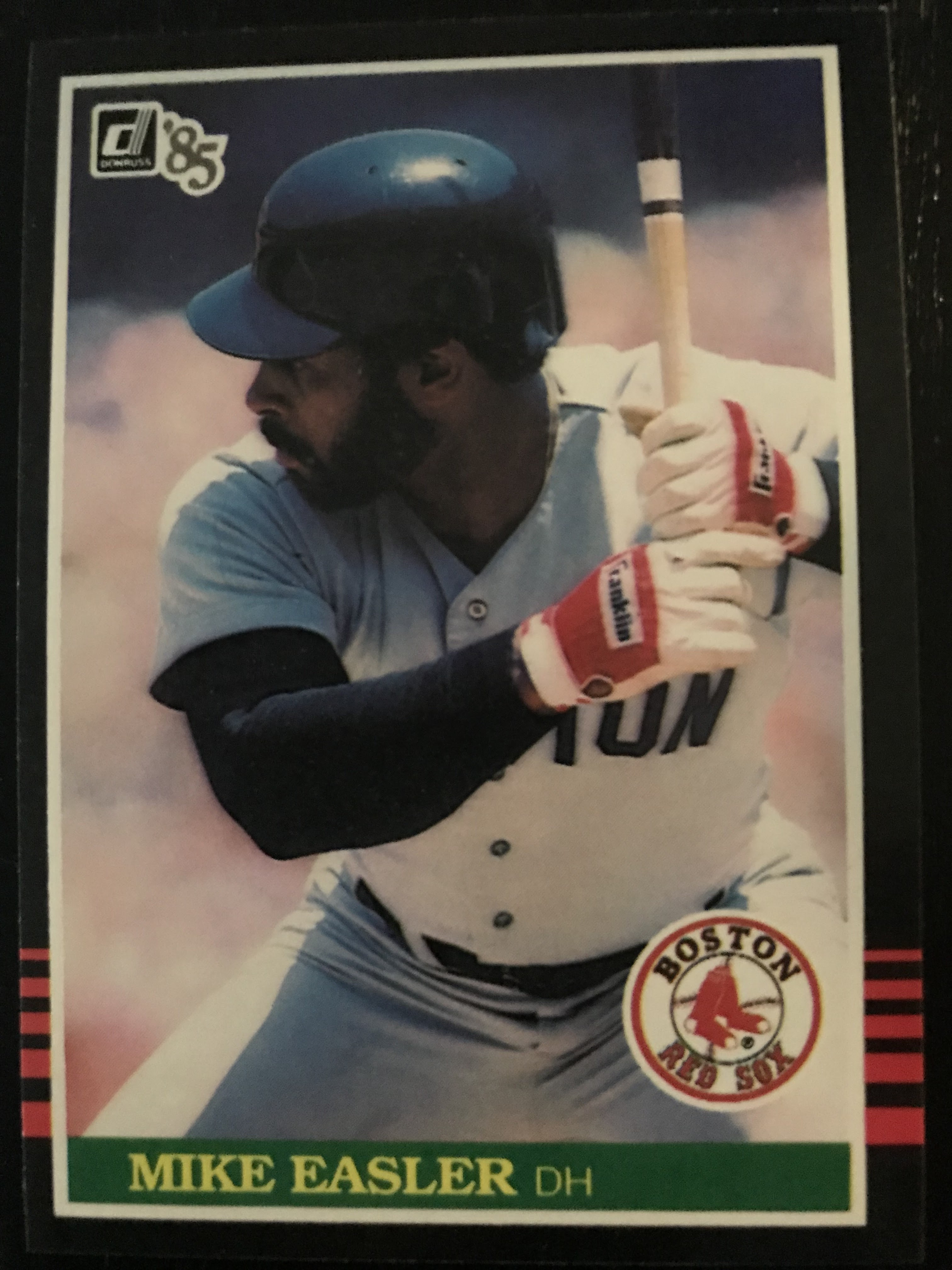
Yeah…a 1985 Topps Mike Easler card. But in my defense Mike Easler was the Hit-Man in Pittsburgh. He was cool. His cards always looked so badass.

Case in Point:


And it was my first time seeing him not in a Pirates uniform (I had yet to really be taken aback by any 1985 Dave Parker cards…no beard!). And, to be honest, there was a certain level of intrigue in seeing Pirate players not in Pirates uniforms. To an 11-year-old they were an oddity.

That would soon wear off.

It was my life’s goal to get as many cards as I could in 1985. It seemed like that was becoming every kid’s life goal. If I remember the collecting year of 1986 as being the explosion, when every kid I knew had cards, then 1985 certainly planted the seeds. 1985 was the first year I ever saw anyone try and collect an entire set. Who collected sets? Not I. Cards were dirt cheap in 1985. We bought them with change we found in the couch. I put my star cards in one box and my Pirates in another. All else be damned.

Of course, it was Phineas who collected the sets.

He was nine and already had more patience and diligence than I ever would.

His sense of pride in completing the 1985 Topps set contrasted with my budding shame in realizing I’d probably never complete the simplest of life’s goals.

Although I did finally finish the 1985 Topps set

…35-years later.

But this blog post isn’t about 1985 Topps baseball cards.

Although I had a ton of Topps cards. And I had a good amount of Fleer too. They were the cards I saw the most in stores in 1985. Topps was everywhere but we mostly bought ours at the Thrift Drug. Fleer was harder to find…but soon the Revco Drug would have them in wax packs and rack packs to satisfy our ravenous need.

But there was one brand of card that was impossible for me to find.

I mean maybe they were at Statlander Drug. But cards at Statlander was never a given. And you risked your life crossing Frankstown and Beulah Roads trying to get there. Mom or, rarely, dad had to drive you to Statlander.  If you were a kid who couldn’t wait long enough for that pipe dream to happen, and if you had a dollar burning a hole in your pocket; Thrift and Revco were your usual dealers.

Be that as it may…my lack of access meant I never got to open up a pack of these guys.


Ah, 1985 Donruss.

I saw them fleetingly as a kid. Maybe in some kid’s collection. 1985 Donruss had black boarders! Who was doing black boarders in 1985? Maybe the American Coin had 1985 Donruss on their shelves. But the Coin was the only LCS I knew about and I was usually so gob smacked by the individual card boxes that we greedily sifted through, by the time I’d realize a product like Donruss was on the shelf, I would’ve already spent the money I had.

I’m sure Card Shows had 1985 Donruss, but back then Card shows seemed mythical to an 11-year-old kid. You found out about card shows via word-of-mouth. No kid I knew had the extra money to drop on an issue of Beckett to see what was going on around town. Even if I knew of a card show back then, I was eleven, I had to beg an adult for a lift. And it was hard to find a parent who had to work 40-hours a week to feed the Capitalist beast, who was willing to spend an entire morning and afternoon on their Saturday at a card show. Card shows were something we did at 12 or 13 and older, when we could just be dropped off at the door, and trusted to not act like idiots in public.

No, in 1985, a kid like me was mostly beholden to drug stores and supermarkets for our cards.

And that meant no 1985 Donruss.

Because of that, 1985 Donruss has always held a mystique to me. If I’m buying cards of an old-timer for my PC, I’ll usually grab their 1985 Donruss with one of my first purchases. Do I think they’re the best-looking cards of 1985? Nope. That distinction goes to 1985 Fleer. But when I was in a LCS recently in Pittsburgh and I had the choice between buying a 1985 Fleer or 1985 Donruss set, did I choose Fleer? Nope.

I chose this.


In fact, I think it was a moral imperative that I did.

I did it for the envious, denied 11-year-old who still resides somewhere in me.

And I like 1985 Donruss. I like it a lot, actually. The black boarders have a little bit of wear to them. But not much. The pictures on the cards are a little blurry. But not much. Donruss sequences its checklist in a strange way. What I mean by this is that they give you a lot of red meat right up front. Just looking through the first 100-cards of the 660-card set, there are 14 base cards of Hall-of-Famers.


Granted, it 1985 they were all star cards of future Hall-of-Famers, but they were star cards nonetheless. And considering the first 46 cards in Donruss are taken up by Diamond King and Rated Rookie cards, that’s 14-star base cards from card 47-100.

Of course, there are other star cards throughout the set.

Here's one


I don’t know about you, but I’ve always been curiously excited when I come across a Pete Rose card where he’s wearing an Expos uniform.

Maybe it’s the Mike Easler effect.

He’s in the set too.


So is a still-strange-to-this-day beardless Dave Parker.

The two big rookie cards are in 1985 Donruss.


Of course, in 1985, these two would’ve made any collector happy as well.


I collect Doc and I still love that Davis card.

And I love how kind Dornuss always was in putting the year on the front of their cards.

I’ve talked a lot about set building on this blog, and my issues with doing so. I had an initial plan of trying to build my childhood sets by hand. In some instances, that’s simply not feasible. Looking at BBC Exchange, a wax box of 1985 Donruss goes for $395 and that’s too rich for my blood. So, I decided if I see a set from that era and its reasonably priced, I’m going to treat myself to it. It’s not as fun that way, but I’m building enough cheaper sets on my own that I’ll take an enjoyment hit on the building part of sets like 1985 Donruss, to focus on the enjoyment part of looking at them in binders.

Which is something that I need to do!

But it’s been so damned hot lately.

Still, I’m going to pick a morning. A morning soon, if this heat ever breaks. I’m going to sit down with the 1985 Donruss set, a binder, a fresh pack of 9-pocket sheets. Maybe I’ll throw on a little bit of music. Some Madonna or Huey Lewis and The News. I’ll fire up the flux capacitor. Give the DeLorean a spin. Open up an ice-cold can of New Coke.

And start sifting through a missing part of my childhood.

See what I was missing.


Thanks for reading! Happy Collecting!


Next Friday: Let’s rank 1960’s Topps baseball cards!


Friday, July 29, 2022

On the Road to Pittsburgh : Sports Card Shopping in the Steel City


Thomas Wolfe was wrong.

            You can go home again.

            I’m sure I make that joke every single time I go back to Pittsburgh and write about it on here, or elsewhere. I get it that I’m not quite getting what Wolfe was getting at. I’m no Wolfe scholar. I’ve read a bio on him, and visited a few places he lived in New York City…and that’s about it.

            I still can’t make it through one of his novels.

            But I digress.

            You can go home again and the wonderful thing for me is, the older I get, the more I leave the baggage of why I left home in the first place, sitting at someone else’s door. When I was a younger man, I couldn’t wait to leave Pittsburgh. I wanted to leave so badly but had no way to leave. It became a running joke, my desire to flee.

My parents called me George Bailey.

But I did get out. And getting out is hard. Especially moving to somewhere like New York City. Nothing prepares you for the place. It took me six months to even feel like I scratched the surface. Eighteen years later and I’m still sometimes like, what in the hell am I doing here. But leaving helped me appreciate where I came from a great deal more than it ever did when I was living there and dreaming of being somewhere else.

            That is to say, I like Pittsburgh.

I get a little smile when I get off the plane and this guy is waiting to greet me.

And being a sports card collector, coming home to Pittsburgh is a good way for me to stock up on all things, Pirates, Steelers, and Penguins.

The first place I hit was the Baseball Card Castle on Route 19 in Cranberry Township.  


Cranberry is a sprawling suburb about 21 miles north of the city of Pittsburgh. The Penguins train in Cranberry, for all of you hockey fans out there. I lifetime ago I dated a girl from Cranberry and spent a good deal of time in its fast-food restaurants and strip malls. That was 1994. It amazes me how much the place has built up since then. Commerce is a strong draw toward available land.

But, again, I digress.

I first went to the Baseball Card Castle back in December 2021. I love it. It’s an old school card shop in the truest form, and not lacking in size. Any collector would get a kick out of the Baseball Card Castle, and maybe feel like they’ve been taken for a nostalgia ride back to the heyday of the local LCS. The display cases are stuffed with cards and team sets, especially those of the three big local teams. There are pack and wax boxes galore. The walls are covered with purchasable ephemera, and in the back of the store there are shelved filled with baseball, football, basketball and hockey sets from the 1980s on up to now.

In fact, I bought me a set that I’ve really been digging lately.


I think because I didn't have much access to them, there's still a certain mystique that exists between me and mid-80's Donruss sets. Anything 1984-1986 Donruss and I'm on board.

Also...am I the only one who still thinks it's cool and interesting seeing Charlie Hustle in an Expos uni?

Any good LCS that’s worth it salt will have its share of 25-cent to 1-dollar bins for customers to peruse. Baseball Card Castle was no slouch there. In the limited time I had, I was able to spend some time going through the Pirates and Steelers boxes.

I came up with these gems.


Even grabbed a couple of Pirates team sets from the late 90's and 2000.


            I still can't get over how few cards Topps was putting into their sets during that era. The 25-card team sets that I always looked forward to buying or putting together, were wittled down to maybe a 10-card team set.

To be honest, if I had the money or the gall, I could spend a thousand bucks in the Baseball Card Castle without thinking about it.

Good thing I’m a cheapskate.

The other place I make it a point to visit, is Rossi’s flea market. 

(and,yes, that is a former movie theater)


I’ve mentioned Rossi’s here before, but it bears repeating that it’s a pretty decent flea market in the East suburbs of Pittsburgh. They have three card dealers that I especially like to visit. Again, these guys are pretty local team heavy. But one did have a 25-cent box where I managed to walk away with these guys.


1979 Willie McCovey for a dollar? Okay!


A 1966 Lou Brock that’s a little bit loved for $3. Okay!

One of the other dealers at Rossi’s had a dollar box and I found these guys to add to my PC for each of the players.


(pay no attention to the prices listed on the cards)

I actually have the Tekulve and Candelaria rookies, but I added them to the 1976 Topps set that I’m beyond slowly building. And I mean slowly building. This dealer also had a box of Pirates cards from the 1970s to now that he was selling for 10-cents apiece. So I helped myself out to a few other Buccos I like to collect.


            Of course, I had to get me a 10-cent Otter!


Can’t beat Pirates team sets for 25-cents.


Or even one for $2.


This team set that I found was of particular interest to me.


The above are cards from the 1989 Very Fine Juice Pittsburgh Pirates team set. This is where memory is tricky. In my head, I remembered this team set being issued in the 1989 Pittsburgh Pirates yearbook. It wasn’t. The 30-card set was actually given away to fans at a Pirates home game on April 23, 1989. And thank you Beckett Marketplace for that information. I don’t know about you, but I like having oddball team sets for my favorite team. Especially one from the era where I was a heavy collector.

Very Fine even does a decent job with the backs of the cards.


Yeah, it’s plain. But it’s informative.

And the yearbook set I was thinking of was issued in 1985. Gotta find that one!

Other than Pirates, he did have some boxes for star-cards from the 1950s on up, which I took a look through. A lot of the cards were reasonably priced. But here’s the thing I hate about being a modern collector. Nearly every card I looked at, I kept saying to myself, could I get that cheaper on ComC? SportLots? Thinking like that caused me to pass up a pretty decent 1968 Ernie Banks and 1968 Willie McCovey card.

But I did snag a 1974 Bob Gibson for two-bucks.


I will say that the Banks and McCovey cards were comparably priced on ComC. But I still should’ve bought them then and there.

I think a problem I have as a collector, especially when it comes to players who played before I was a fan of the game, is that I feel like I should grab as many of their cards as I can when I find them reasonably priced. Like the Gibson or the Lou Brock.

Or even this guy whom I found lurking in the 25-cent bins.


I’ve gotten better at knowing what I want to collect. Especially regarding set-building and collecting Pittsburgh teams. But it’s these individual legends, hall of famers, where I’m still just buying random guys when I find them. Not that there’s anything random about Lou Brock or Bob Gibson. I think I might take a look at the ol’ Hall of Famer box at home and really sit down and decide on a core of maybe five to ten players (not counting Pirates) whom I really want to have as a part of my PC. Then maybe I’ll be better prepared when going through star-card boxes.

But I digress yet again.

Speaking of legends, this isn’t totally card related, but when I was home in Pittsburgh, I finally got to go here courtesy of dear ol’ dad.


It’s the Roberto Clemente Museum!

I had been wanting to go to the Roberto Clemente Museum for a good long while now, so this was a real treat.  The museum is by guided tour only. I won’t go over a ton except to say that they do a pretty great job of discuss Clemente’s life, his playing, and his humanitarian efforts. There is a ton of memorabilia there: bats, uniforms, gold gloves, photos, etc.

There’s even the Pirates bench from Three Rivers Stadium.


Imagine the talent that sat there: Clemente, Mazeroski, Stargell, Dave Parker, Al Oliver, Barry Bonds, Bobby Bonilla, and Andy Van Slyke, just to name a few.

And for the sports card enthusiasts there are these babies.


Yep, that’s the entire Topps (and a '63 Fleer for good measure) base run of Clemente cards. There were others, but I wanted a photo of the base. Nothing is graded below an 8. Opinions on grading aside, that’s pretty impressive.

And one day that 1955 rookie card will be mine!

Thanks for reading! Happy collecting!

 Next Friday: let’s take a deeper look at that 1985 Donruss set and talk about 1985 cards in general.


Card Show....yeah.