Friday, May 20, 2022

Ranking 1970s Topps Baseball Cards : How Dare I? Do I Dare?


Have you ever felt like you were doing something out of your element?

            Okay…maybe not that.

            After all, this is a sports card blog, and I am going to write about sport cards.

            Or maybe you’re writing about/doing something you maybe SHOULDN’T be doing?

            Hmmmm, I don’t feel that way either.

            Not really.

            Okay, the thing is…I’m going to be ranking 1970s Topps Baseball card on the blog today. My favorite to my least favorite. Totally my opinions and you are happy to disagree with me. In fact, disagreement in encouraged. It’s discourse.

            We still believe in discourse in America, right?

            So why all of the stressing?

            Well…see…I didn’t collect cards in the 1970s. I was all of five when the decade ended. I wasn’t one of those kids who ripped open the colorful cornucopia of colors in 1975 or did my best to keep my 1971 cards in as good of condition as I could. I wasn’t wowed by the psychedelic awesomeness of 1972, or those interesting action shot of 1973.

            No, I’m a product of 1980s collecting. 1980 itself to be exact. My card are the Junk Wax Era cards. That’s my time. That’s when I thrived in The Hobby. Obsessed over The Hobby. Blew every damned nickel and dime (you could still buy cards in the 1980s using those) on The Hobby.

            What business did I have ranking 1970s cards?

            Well…a lot…I think.

            1970s cards were everywhere when we were kids. You met with/traded with a collector a year or two older than you, and they were bound to have 1970s cards in their collections. Some kid your age has an older sibling who collected? Boom…1970s cards. Most of the bourgeoning LCS that me and my friends found ourselves racing into, their stock of common cards were primarily from the 1970s. I lusted over 1970s sports card like any kid desirous of that which came before him. Sometimes I wanted 1970s cards (and 1960s and 1950s cards) more than the stuff I was opening on a regular basis.

            I think I have a lot of business talking about and ranking 1970s Topps baseball cards.

            So without further ado…let’s get this show on the road.


1.      1976 Topps

            If someone who’d never seen a baseball card said to me, show me the quintessential baseball card, I’d show them 1976 Topps. This year is my favorite of the decade. I’m a man of simple pleasures and it doesn’t get simpler than a nice big photo, a solid white border, a thin colored border, then two bars at the end for the player’s name and team. And how about that little drawing that lists the player’s position?

            Sheer perfection in my book.

            I’ve known some collectors who consider 1976 Topps boring. And that’s…fine. I’d go with modest or unpretentious, but certainly still a beautiful card. The Johnny Bench card above is not only one of the best baseball card photos ever, but also one of my favorite baseball cards ever. The dust hasn’t even settled on whatever play just happened. It’s a great photo of one of baseball’s most badass catchers of all-time. And the simplicity of the card itself, allows for the image to really stand out.


            And the card back! I just really think the card back is…er...groovy. Yeah, yeah is standard Topps green but having that bat and ball design as the only real decorative addition also fits into my simple, modest, unpretentious yet completely elegant design that Topps was doing in the year of our lord 1976. It’s just a solid, well-done card that makes me feel like a collector, like I could’ve been one of those kids back in ’76 ripping them right out of packs and loving the heck out of this set.

            I’m actually trying to build it….am about 200 cards in.

1977 Topps

            Well, I said I liked it simple. I said I liked it modest and without pretention. You don’t get as modest as a card that’s mostly white border. But it’s what 1977 Topps does with that border that matters to me. I love that the border is top-heavy. I love that the team names are in big, bold writing with the player’s name just a little less prominent right below it. We get that small pennant vibe that often shows up on baseball cards, revealing the player’s position. And below that top-heavy border, the rest of the card is given over to the photograph.

            To me, 1977 Topps cards look like comic book covers.

            Sports stars are kinda superheroes, right?

            Before 1976 Topps caught my eye, 1977 had probably been my favorite of the decade for years. If I were born in 1977, I’d proudly be collecting my birth year set. No slouching on 1974…but…come on, man! The Rod Carew care is a personal favorite. I think I told a story about buying one once. Or my friend, Miller, buying it. When I met Miller, he was a huge Rod Carew fan. So, I became a huge Rod Carew fan, although I’d never seen him play, and had no clue he played for anyone but the California Angels. When I saw this 1977 card for the first time my eyes bugged out. Carew? A Twin?

            I’ve been a fan of that year’s style ever since.

            Now, the back of the card.


            Another simple design. More Topps green, although less saturated with the dye than 1976. The cards have a little comic box with a bit of baseball trivia. There’s one facet of the card that in all my years of collecting and loving 1977 cards, I never realized, until I listened to Matt Sammon’s awesome, and sadly missed, Wax Ecstatic podcast. It’s the little stands at the bottom of that card that make the stat line look like it’s a billboard you’d see on the side of the road. Topps designers even added little patches of grass.

            A classic design.

 1978 Topps


            That script team name. That bold color borders. The great photography…come on, isn’t this Reggie card iconic? The orange backs with navy blue trimming. The play ball game too. 1978 Topps baseball is one again one of those I wish I was around to rip in wax pack form. I mean as a collector. I was around. But I was four.

            I’ve been a fan of this design my whole entire collecting life, and even those years when I wasn’t collecting and came across cards. Topps doesn’t seem to use the 1978 design in many of its Archive or other throwback inserts…and that’s fine with me. I like that we don’t get much 1978 retread. It keeps the set special for me. Makes that Reggie card all the more iconic. My Eddie Murray rookie card all the more special.


            And see what I mean about those backs? The orange and darker blue really play off each other to give the card a crispness and clarity that some of the green and black ink backs of the seventies don’t.

            Another winner from a great decade of cards.


1972 Topps


            Groovy! Come on get happy! Far out! There are two sets in the 1970s that scream 1970s for me and 1972 is one of those sets. I love the psychedelic, acid-washed, black-light poster-on-your-wall feel of the front design. 1972 has a lot of color but it isn’t overwhelming. Topps took a step-back on the action that year, and that’s fine with me. I like the In-action cards for what they are. And, in taking a step back, you get great posed photography like the Henry Aaron card. Or, my favorite card from that set, the Roberto Clemente card.


            Its solemn, it’s sad, it The Great One eyes cast downward and focus on the ball bouncing in and out of his hand. It’s like an eerie, unintended foreshadowing to the fact that Roberto would be gone by the end of that year.


            The backs of the card help complete the picture too. 1972 Topps gave the decade it’s first taste of the rich, orange backs that would be repeated in the aforementioned 1978 Topps. I like the way the stats are bordered around the white. Both the front photo and back statistic feel almost like coat of arms to me.

            Groovy to the max.

            I think these cats would approve.


1971 Topps


    Another Icon of the decade. Maybe in the running for the icon Topps design of the decade. The all-black bordered, hard-to-find-in-good-shape 1971 Topps Baseball card. I know my Clemente card is pretty beat-up. But I love it because its one of the few cards that I kept from my youth when I initially stopped collecting in 1992. All of the shades and colors really add to my enjoyment of that year’s brand. The black contrasts really fantastically with the bold colors of both the team name, the player’s name, and even the position. If you’re a Pirates fan like me, on the 1971 design Three Rivers Stadium really begins to make its presence felt on the cards. Yeah, it’s a cookie-cutter…but it’s where I saw nearly all of my professional baseball when I was a kid.


            Now the backs….eh…the backs of 1971 Topps. There iconic as well. I believe this is the first time in Topps history that an image of the player was used on the back of the card as well as the front. And…I like it. But you know what I’d rather have instead? The players full career statistics instead of just the 1970 season and their career totals. I’m funny like that. Probably why I never truly enjoyed the backs of Donruss cards either.


1974 Topps


            My birth year…and a pretty good year for Topps baseball cards as well. The action shots at least a step up. The Pete Rose card is probably one of my favorite images on a 1970s Topps card. It’s not ’78 Reggie or ’76 Bench for me, but I’ve always been drawn to it. 

          In 1985 Fleer liked the image so much they tried to make one of their own


        Topps has used banners or pennants or what-have-you designs on their cards before, most notably 1965 Topps, another favorite of mine, but I do like the way the banner-border top and bottoms the card for the team name. Both city and team.

            That said…I have a pretty sordid history with this set so…


            As for the backs. I don’t particularly think there’s anything special about the backs of 1974 Topps cards. It’s your standard green ink coupled with a darker ink. I like the player’s signature added on the back with the player’s name in print. Beats it being on the front of the card, like Topps was about to do on and off for the rest of the decade and into the early 1980s. 


1975 Topps


            The other set from the 1970s that SCREAMS 1970s to me, is 1975 Topps. I don’t want this to be a controversial opinion…and maybe it isn’t. But I’m not, and never have been, wowed by 1975 Topps baseball cards. Though I can understand the fandom. And I love watching my fellow hobbyist get cards from the 1975 set or try and finish the 1975 set in regular and mini form.

            Topps had mini cards in 1975...which I'm not really a big fan of either.

            If 1975 Topps baseball typifies or SCREAMS the 1970s, as I’ve opined; then why am I not its biggest fan. It’s simple. There’s too much color in the set. Wherein I think 1972 gets the color and the so-called flamboyance of the era right, 1975 feels gaudy. I’m not a big fan of the two-tone borders. Though I do like the bold way the team name is on top of the card. When I was trying to get 1970s cards as I kid, ’75 was just always the design I shied away from spending my money on.  Even as an adult collector, any guys who had cards in the 1970s that I PC, their 1975 card tends to be one of my last purchases…or I haven’t even purchased it at all yet.

            Now the backs…


            I’m actually a fan of the back of 1975 cards. More so than I am the front. The red, green, pink and white combo feels totally original to me. Or I’m just enamored with the way it looks. I know, I know, it seems wrong to be so meh about the front design of 1975 Topps baseball but to be an advocate for the back of the cards. I feel you.

            But I can’t help how I feel.


1979 Topps


            Believe it or not, 1979 Topps used to be one of my favorite cards designs. This was the set the kids a year or so older than me had a ton of when I started collecting in 1980. This meant I wanted 1979 Topps cards. Would trade what I could to get them. Thought about 1979 cards. Lamented over the fact that I wasn’t a year older and could’ve started collecting cards in 1979. Based on my sermonizing on simplicity, 1979 Topps baseball card should probably still be on of my favorite sets.

            But it’s not.

            There’s simplicity and then there’s out and out boring. And that’s what 1979 feels like to me. It feels boring. Phoned in. It’s the only set of the decade that has to put the big Topps logo right there on the front of the card. Guess Fleer was really breathing down their neck by that time. You’d think they’d want to have something more exciting than a photo, a plain white border…and…a banner?

            Is that a banner?

            As for the back of the cards? 


            Meh. Topps has been there and done that so many times that decade with a green back, some card stock gray, and choose your dark ink. And 1979 seems the least inspired of all of them.


 1970 Topps


            I…I didn’t really know where to put 1970 Topps on this list. I know that it isn’t one of my favorite sets. But I don’t know that it’s my second to least favorite set. The worse I can say about it is that it’s kind of a dull card, albeit with a gray instead of white border, with some mostly un-exciting picture of players. If I have a reason for liking the cards, its for the fact that 1970s Topps is the last set that will show the Pittsburgh Pirates in their short-sleeved jerseys and the all-black hat that they wouldn’t bring back until 1987. It’s the last set to really show Forbes Field in the background.


            Like 1975…I LOVE the back design on the 1970 Topps baseball set. The blue and yellow on the white card stock really stands out in contrast the rather drab front side of the card.


1973 Topps


            And last but not least…1973 Topps. You know how all the way up above I said I was a man who preferred a simple design. Quite a number of words later, I still do adhere to that way of thinking. But then there’s 1973 Topps baseball. With its overwhelming white border. With action shots that look like they were taken with a camera on zoom from up in peanut heaven. With a just not that exciting design, placed in the decade between one of Topps best offerings (1972) and a pretty solid 1974 set.

            The only thing that ever sells me on 1973 Topps is that Wille Mays and, sadly Roberto Clemente have their last official cards in that set.

            It’s also last Topps set to be sold in series form until 1993.

            But I do like the 1973 card backs. 


            I like the black and gold motif, which I don’t think Topps used again until the Art Deco backs on their 1990 release. I like that the stats are vertical instead of horizontal…something I also like about the 1975 backs. But its not enough to sell me on a rather dull card with sophomoric action photography.


            Whew…okay…so I did it. But did I do it well? Is there someone sitting at home reading, saying “stick to the 1980s and leave the 1970s Topps releases out of your mouth, punk!” Look, I will say this: ranking anything is hard. And for the 1970s baseball releases and me, it’s doubly card. Ranking best to worst in a decade where I thought Topps really tried to flip their game on its head is maybe a fools game. And as I said above, I’m completely enamored with this decade and its card releases. They’re all legendary to me.


Thanks for reading! Happy Collecting!


NEXT FRIDAY:  Russell Streur will be back for Memorial Day Weekend with a piece on collecting Milwaukee baseball cards....Hmmm...does the Bucco fan in me approve of that? I'm sure you're all going to love it. It'll be good to have Russell back! 


Friday, May 13, 2022

On the Road to Pittsburgh : Card Purchases in the Steel City


I promise this will be the last one of these types blog posts for a bit.

            These look-what-I-got blog posts.

            But…HEY…LOOK WHAT I GOT!

            I kid.

            But over the last weekend, I got to go home and visit family, see a Pirates game, and, oh, yeah, do a little bit of card shopping at my favorite flea market and antique store. This blog post was supposes to have been about a combined trip to Buffalo AND Pittsburgh…but let’s just say that COVID-19 isn’t do with us yet.

            Buffalo will happen.

            First things first, my awesome brother gave me this.


            Just straight up gave it to me.

            I’m not an autograph collector…except in certain circumstances. And Pirates players from my childhood ARE those circumstances. Especially ones that I actively collect like I do with Dave Parker.

            On Sunday, Mother’s Day, I was up bright and early to hit my favorite Flea Market, Rossi’s, in the North Versailles suburb of Pittsburgh. Rossi’s has three main card dealers that I like to…um…deal with. If you read last week’s blog post, then you know I’m shifting gears into over-drive collecting cards from Pittsburgh major sports team. And there’s no shortage of Pittsburgh sports team collectibles at a Pittsburgh flea market

            The first vendor I went to had a big ol’ box of Pittsburgh Pirates cards from the 1950s on up to the 2020s for me to sift through. It was the kind of box a Pirates collector would want to buy en masse. And I probably should’ve taken the opportunity to have purchased some cards from the 50s and early 60s. But I had an agenda. And that agenda was to begin adding cards to my personal collection of Buccos.

            I added a few cards to my Manny Sanguillen collection.


            And my Andrew McCutchen collection.


            This vendor even had a 2021 BL Ke’Bryan Hayes rookie card. The first of any of the 2021 BL Cards that I’ve purchased.


            The next card vendor I went to is probably my favorite at the flea market. Not only does he have a large assortment of Pirates, Steelers, and Penguins cards, he has big bins of $1 cards, and three humongous boxes of 10-cent Pirates, Steelers and Penguins cards. I spent to bulk of my time sifting through the Pirates ten-cent box and came up with these.

            Some Tony Pena anyone?


            How about a little Teke?


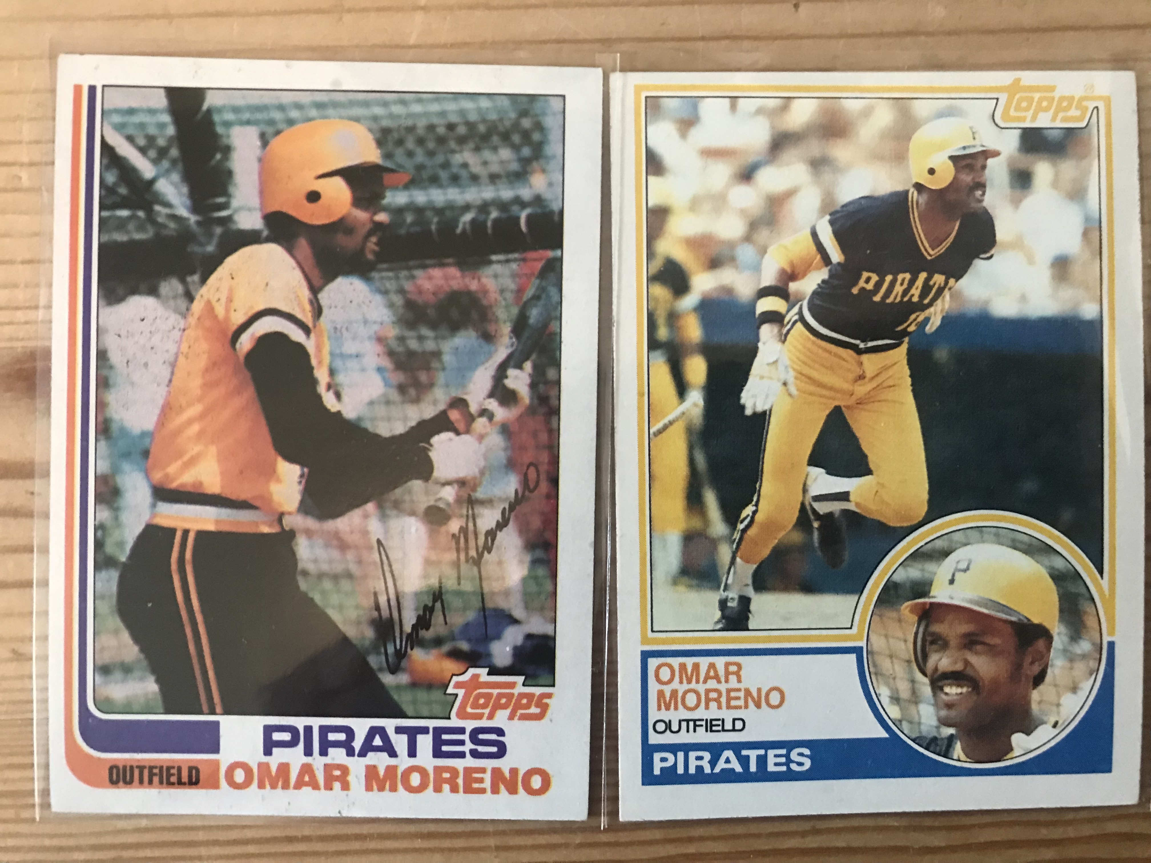
            Omar Moreno your cup of tea?


            Got my fill of The Candyman.


            And the Hitman.


            Including his rookie card. 


            My lone Bill Madlock purchase.


            Then there were these guys.


            Yeah…I know…Dodgers cards. But these are Dodgers cards in name only. Sid Bream and R.J. Reynolds were major contributors to helping bring the Pittsburgh Baseball Club back to its winning ways in the late 1980s/early 1990s. I was a huge fan of both, so naturally I wanted their rookie cards. The vendor saw fit to include them in a 10-cent Pittsburgh Pirate box. So….

            And, no, we’re not going to talk about Game 7 of the 1992 NLCS.

            Fun Fact: Sid Bream and R.J. Reynolds were traded to the Pirates for Bill Madlock.

            In my worldview…if you come across 10-cent Bobby Bonilla Rookie cards and XRCs…you buy them.

            So I did.


            And some other Bobby Bo cards as well.


            Let’s not forget Mr. Andy Van Slyke, the best centerfielder I’ve ever seen play the game.


            And while we’re reminiscing on the 1986-1992 Pirates, I grabbed myself some cheap-o 1993 Topps Jose Lind and Bob Walk cards as well.

            Not bad so far?

            But…but…

            Every team has a dark history. A period they’d rather forget. For me, that would be the 1993-2012 Pittsburgh Pirates. Twenty full years of losing seasons. To put that in perspective that era includes Barry Bonds leaving and Andrew McCutchen arriving. Let’s just say I watched a lot of bad baseball during that era. And I tend not to appreciate or really acknowledge the players I rooted for during that length of time, especially from 1993-2002, before I moved from Pittsburgh to Brooklyn, New York.

            But history is history, right?

            And time heals wounds.

            So, I’ve started thinking about players from that losing era I want to collect.

            I found these two guys in that 10-cent box.


            To be honest, it was nice to sit back and think about that time. Not the losing. But the hope that was always there.

            The hope that arrived with Andrew McCutchen.

            And these two guys.


            Yeah, Pedro Alvarez probably deserves his 10-cent status. Overall, he was a bust for the Pirates. But for a small window…man, he felt like the second coming of Willie Stargell.

            And this guy felt like the second coming of Dave Parker...but the Pirates traded him away.


The last thing I found via this vendor was this.


            I mentioned last week about collecting Steve Blass cards. Well, the 1965 card is his rookie card. To me, that was an amazing find for $3. In fact, when I brough my 10-cent haul and my Mr. Blass card up to the guy running the joint; he only charged me $3 for the whole lot. So, I paid for Blass card and every else was…free?

            Or else I was doing him a favor.

            The last vendor at Rossi’s is guy I’ve been going to, to complete some sets. He has a lot of boxes of commons from various Topps years. The last time I was in he helped me with my 1980 Topps set. This time I was looking to put a dent in my 1981 Topps set. Thankfully, the vendor had some 1981 Topps.


            Sadly, they were all out of order so picking through was kind of impossible. Thankfully, he was willing to sell me his whole lot of cards for a reasonable price. That means this weekend, I’ll be going through the cards and plugging in my missing spots.


            I’ll also be going through these bad boys.


            Found a 500-card lot of 1981 Fleer cards at The Hub, my favorite antique store, also located in the North Versailles suburb of Pittsburgh. I know I’ve been ragging on my set building here as of late. But you can’t look a cheap 500-card lot of Fleer in the face and walk away. So I bought them. And I’m going to make the set. Looking through the box, there are some doubles. But if I can get 200-300 cards into the set I’ll call it a success.

            I also came across this.


            It’s in pristine condition and there isn’t a single sticker in there.

            But I want there to be.

            I’m thinking of getting myself a box of 1981 Topps Stickers and putting the album together. That said, I am worried that, due to age, the stickers won’t stick. But, because I’m a part of the greatest and most helpful hobby in the world, I reached out on Twitter to some fellow collectors, and they were all kind enough to give me ideas on how to make this sticker book work even if the stickers don’t stick right.

            Thanks to all of you for that.

            If I build the 1981 sticker set, I’ll post updates here on the blog.

            Finally, no trip to Pittsburgh should ever happen without a trip to this place.


            Hands down the most beautiful Major League Ballpark in the country.

            Yeah...I know…I’m biased.


Thanks for reading! Happy Collecting!


NEXT FRIDAY:  Like I said, enough with the show-and-tell. Let's travel somewhere, shall we? Or should I rank something? Yeah....let's do that! I'm going to go over my head and rank Topps 1970s baseball cards from what I feel are best to worst. I know, I know...it's been done. But not by me! 


Friday, May 6, 2022

Coming Out of the Abyss : A Collector Begins to See the Light


So…

            I did one of those things.

            You know those things some collectors do?

            I’ll start from the beginning.

            Remember a few weeks ago when I wrote a blog post here saying that me and Topps Heritage cards were breaking up again? No…no…I didn’t break down an buy a hobby box of Heritage after all. Although I still don’t trust myself. I did receive a fat pack of them for my birthday, though. Thanks monkey! I even got an Acuna, Tatis Jr. and another Oneil Cruz rookie card in the same pack.

            Not too shabby.

            What I did is…you know those collectors, right? The ones who don’t buy the hobby box but then go on Twitter etc., and show you all of the cards that they bought for the same cost as said hobby box, and how much happier they are with that purchase?

            Those guys.

            Yeah…I’m going to be one of those guys this week.

            Look, I might’ve said I was breaking up with Topps Heritage. But I didn’t say I was going to not spend the money that I would’ve spent. That would be silly! Instead I decided to take the equivalent (or around their) and put them to some purchases that I really wanted and had been longing to make. At the time, Heritage presale hobby boxes were going for around $101.00. So, I used that number and factored in the $12 shipping that I’m usually hit with when I buy hobby boxes online. That gave me a foundation of $112.00 to work with.

            Let’s see how I did.

            I’m not one to beat around the bush, so here’s the big fish first.


            Pretty cool, huh?

            I’ve wanted a 1966 Roberto Clemente since I was a kid. I don’t remember what year it was buy Topps gave out a promotion at MLB games that was a booklet showing you teams base cards from every year Topps had produced them up to that time. On the cover of the booklet for the Pirates they used the 1966 Roberto Clemente card. I’d obviously seen the card before at card shows but seeing it on that cover made me really want the card for my collection.

            Fast forward some 35+ years later…

            And it’s in not too bad of shape.

            Or what I call affordable shape.

            The next thing I did was fill in some gaps I had for a few Pirates that I collect.

            Added some Al Oliver cards to the collection.


            Some Manny Sanguillen cards…including his awesome 1968 Topps rookie cards.


            And I added some cards for Ed Ott.


            In fact, between this and what I already had, I think I now have all of Ed Ott’s Topps Pirates base cards.

            And…yes…I’m aware that the toploaders are probably worth more than the Ed Ott cards themselves.

            I made sure to finally get myself the 1982 Topps Traded solo rookie card of Johnny Ray, who was my favorite Bucco from 1982 until he was traded to the Angels in 1987, and my world became about Bobby Bonilla.


            If you were a kid in Pittsburgh when you were my age, you were probably aware of how amazing Steve Blass was in the 1971 World Series. You were also probably aware of the fact that just a few seasons later, Blass found it next to impossible to throw a strike and was out of baseball before the end of the 1974 season. If you were a kid in Pittsburgh when you were my age, you knew Steve Blass as the funny, informative color man on Pirates TV and radio broadcasts from 1983 to 2019. A Pirate with 60 years in the organization and the announced inaugural member of the Pittsburgh Pirates Hall of Fame.

            Yet I didn’t have a single card of his in my collection.

            Well…I changed that.


            And I also added some rookie cards to some Pirates who had a real impact on those playoffs bound 2013-2015 teams.


            And let me introduce you to the founding set of cards for my, and I promise, promise, promise Pittsburgh Penguins ONLY Hockey card collection.  Anyone who’s read THIS blog post will question my sanity.


            And, of course, because I like it when players appear on designs that they shouldn’t have been initially on…I had to get these two.


            That said, had Fleer been allowed to produce the entirety of their 1963 set, Willie Stargell could feasibly been a part of it.

            That Bobby Bo card is the first one I have of him in a Dodgers uniform.

            And then there’s this card.


            A long while ago I wrote a blog post on Curt Roberts who is often, even officially by the Pittsburgh Pirates, listed as the first Black player in Pirates team history. BUT…and there’s a BIG but here...that distinction could very well go to Carlos Bernier. Bernier, a player from Puerto Rico, played one season, 1953, in Pittsburgh. Because he was of Puerto Rican descent, the Pirates did not consider him either white or Black. Although, it should be noted, Carlos Bernier considering himself to be Black.

            That being said…look, Charles F. Faber at SABR can do a MUCH better job with this than I can.

            I got Carlos’ card, one I could afford, and the ONLY original era Bowman cards (1954) that I currently have in my collection, because I wanted to celebrate both him and Curt Roberts, whose cards I did previously have in my collection.

            Last but not least…I went outside my Pittsburgh box once…I present to you Mr. Dick Allen.


            I recently finished reading Mitchell Nathanson’s fantastic bio on Dick, God Almighty Hisself: The Life and Legacy ofDick Allen, and found myself enthralled with the man depicted in the book. Let’s just say Dick was a true original in baseball during an era when an original was hard to come by. And he was his own man. Back when we were kids, Dick Allen was the type of older player whose cards some of us actually had because they were affordable. When I got back into collecting, I knew that I wanted Dick’s cards in my collection. Most of what I had previously were the cards from the tail end of his career. This is the first time I’ve ever had anything of his from the 1960s, and Allen’s tumultuous, and believe me when I say tumultuous time in Philadelphia.

            So…was it worth it?

            Buying these cards instead of that Heritage hobby box?

            100% yes.

            In a more direct way, buying these cards, Dick Allen cards aside (although he is from a small town less than 100 miles from Pittsburgh), has helped sharpen my focus as to where I want my collection to go. And that’s…well…home. Pittsburgh. I could feel it happening slightly. I tend to write on here about Pittsburgh players. A lot of my card examples are Pirates and Steelers. Building sets is one thing. Or not building sets if you read my post last week. Building on history is another.

            What I’m trying to say is I want my card collection to focus more on the teams from the city of my youth. The place I still call home. Pittsburgh. I didn’t realize it at the time, but this ComC purchase reflected exactly that. I’ve been thinking an awful lot about this. And instead of building sets, save a few, I’m going to be focusing my collection on all things Black and Gold. Putting together team sets from years gone by. Putting together a PC of Pirates, Steelers, and I guess now, Penguins players who’ve meant something to me. And Not just the Clementes, Stargells, Bradshaws, and Mario Lemiuexs. But players like Ed Ott. Johnny Ray.

            Maybe even this guy.


Thanks for reading! Happy Collecting!

NEXT FRIDAY: I'm going to add some fuel to this week's fire....Pittsburgh sport team card pick ups from my trip to Pittsburgh and other Pittsburgh sports related goodies!


Recent Card Show Thoughts